

Madden-Julian Oscillation#
Overview#
The Madden-Julian Oscillation (MJO) represents the largest subseasonal (30 to 90 day) atmospheric variability in the low latitude tropical atmosphere. MJO is an eastward traveling atmospheric pattern, moving between 4 to 8 m/s, which influences the location and strength of rainfall in the tropics[1].
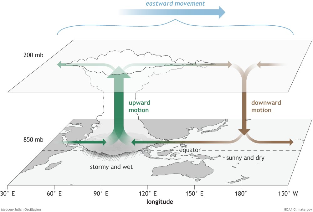 (Image credit: NOAA-PSL)
MJO was discovered in 1971 by Roland A. Madden and Paul R. Julian[2] at the National Center for Atmospheric Research (NCAR).
Wheeler-Hendon Phase Diagram#
Overview#
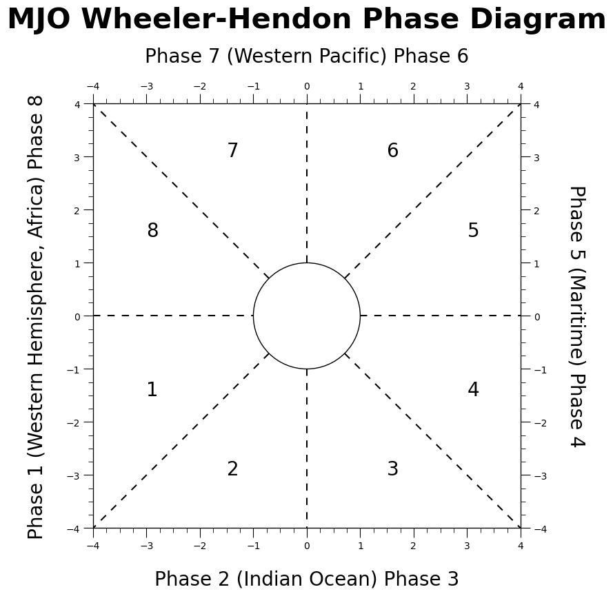
The Wheeler-Hendon diagram is a phase plot and diagnostics tool[3] to quantify the strength and significance of the MJO over time. The plot represents the Real-Time Multivariate MJO (RMM) which is made up of a pair of empirical orthogonal functions (EOF). EOFs are created from the combined equatorially averaged 850-hPa and 200-hPa zonal wind and the outgoing longwave radiation (OLR).
Outgoing longwave radiation: The longwave radiation emitted from the top of the Earth’s atmosphere into space
Zonal wind: The zonal wind anomaly at 200-hPa and 850-hPa represents the changes in the atmospheric circulation
The pair of principal components from the EOFs form two indices: RMM1 and RMM2. The phase relationship between the two zonal winds determine the motion of the MJO.
RMM1: Represents the MJO’s amplitude. A larger RMM1 indicates stronger MJO activity. Negative values indicate a inactive or suppressed MJO phase and positive values indicate an active or enhanced MJO circulation
RMM2: Represents the MJO’s phase. The phase determines the geographic position of the MJO’s convection center. It is split into eight phases, each representing to a specific equatorial region
|
|
|---|
Workflow#
import pandas as pd
import numpy as np
from matplotlib import pyplot as plt
import matplotlib.ticker as ticker  # force integer ticks on axis
import matplotlib.lines as lines  # add phase division lines
Example Data#
For the purpose of this notebook, we will be pulling data from NOAA’s Physical Science Laboratory (PSL). PSL offers near real-time and historical RMM MJO data.
def retrieve_NOAA_data(data_type=None):
    # https://www.psl.noaa.gov/mjo/
    url = f"https://www.psl.noaa.gov/mjo/mjoindex/{data_type.lower()}.cpcolr.1x.txt"
    column_names = ["YYYY", "MM", "DD", "HH", "RMM1", "RMM2", "Phase"]
    try:
        df = pd.read_csv(url, sep=r'\s+', header=None, names=column_names)
        print(f"Retrieving data from: {url}\n")
        return df
    except Exception:
        print(f"invalid url: {url}")
        return pd.DataFrame(columns=column_names)
We will be retrieving the data related to the Real-time OLR MJO Index (ROMI). See PSL MJO for more daily MJO index values for dates from 1979.
noaa_df = retrieve_NOAA_data("ROMI")
noaa_df
Retrieving data from: https://www.psl.noaa.gov/mjo/mjoindex/romi.cpcolr.1x.txt
| YYYY | MM | DD | HH | RMM1 | RMM2 | Phase | |
|---|---|---|---|---|---|---|---|
| 0 | 1991 | 1 | 1 | 0 | 0.12526 | -0.06945 | 0.14323 |
| 1 | 1991 | 1 | 2 | 0 | 0.18542 | -0.04887 | 0.19175 |
| 2 | 1991 | 1 | 3 | 0 | 0.23960 | -0.03933 | 0.24281 |
| 3 | 1991 | 1 | 4 | 0 | 0.27446 | 0.01990 | 0.27518 |
| 4 | 1991 | 1 | 5 | 0 | 0.27714 | 0.07555 | 0.28725 |
| ... | ... | ... | ... | ... | ... | ... | ... |
| 12978 | 2026 | 7 | 14 | 0 | -0.61788 | -0.87441 | 1.07069 |
| 12979 | 2026 | 7 | 15 | 0 | -0.54143 | -0.86486 | 1.02035 |
| 12980 | 2026 | 7 | 16 | 0 | -0.39553 | -0.91555 | 0.99733 |
| 12981 | 2026 | 7 | 17 | 0 | -0.16312 | -1.03409 | 1.04688 |
| 12982 | 2026 | 7 | 18 | 0 | 0.02019 | -1.08730 | 1.08748 |
12983 rows × 7 columns
The table above shows NOAA PSL MJO time series data as:
YYYY: Year
MM: Month (1-12)
DD: Day (1-31)
HH: Hour (always 0, can be ignored)
RMM1: Real-Time Multivariate MJO Principal Component 1
RMM2: Real-Time Multivariate MJO Principal Component 2
Phase: Amplitude of MJO where sqrt(RMM1^2 + RMM2^2)
For the purpose of a plot, we will be using the datetime (YYYY-MM-DD) and RMM1 and RMM2.
Plotting Phase Diagram#
The function mjo_phase_plot() below has four input arguments, including three optional arguments with default values.
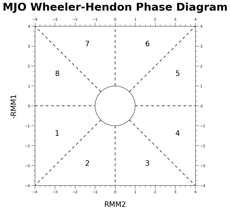
data: pandas dataframe containing data (data requires the columns:["YYYY", "MM", "DD", "RMM1", "RMM2"])radius: circle in the center of the plot which represents when MJO phase value is significant (defaults to 1)month_colors: colors for each month on plot (color for the 12 months defaults to["tomato", "dodgerblue", "orange", "green", "magenta", "yellow", "pink", "cyan", "gold", "lime", "darkviolet", "olive"])rmm_axis_label: replace phase axis labels with RMM1/RMM2 labels (defaults toFalse, with all phase and geographical locations)
def mjo_phase_plot(data=None, radius=1, month_colors=[], rmm_axis_label=False):
    fig = plt.figure(figsize=(8, 8))
    ax = fig.add_subplot(111)

    # set x and y axis labels
    ax.set_xlim(-4, 4)
    ax.set_ylim(-4, 4)
    ax2 = ax.twinx()
    ax3 = ax.twiny()
    ax2.set_xlim(-4, 4)
    ax2.set_ylim(-4, 4)
    ax3.set_xlim(-4, 4)
    ax3.set_ylim(-4, 4)
    if not rmm_axis_label:
        ax.set_ylabel(
            "Phase 1 (Western Hemisphere, Africa) Phase 8", fontsize=20, labelpad=20
        )
        ax.set_xlabel("Phase 2 (Indian Ocean) Phase 3", fontsize=20, labelpad=20)
        ax2.set_ylabel(
            "Phase 5 (Maritime) Phase 4", fontsize=20, labelpad=40, rotation=270
        )
        ax3.set_xlabel("Phase 7 (Western Pacific) Phase 6", fontsize=20, labelpad=20)
    else:
        ax.set_xlabel("RMM2", fontsize=20, labelpad=20)
        ax.set_ylabel("RMM1", fontsize=20, labelpad=20)

    # add amplitude circle
    amplitude_circle = plt.Circle((0, 0), radius, fill=False)
    ax.add_patch(amplitude_circle)

    # add phase diagram lines
    ## Phase 1-8
    phase_line = lines.Line2D([-4, -radius], [0, 0], linestyle="--", dashes=(5, 5))
    ax.add_line(phase_line)
    ## Phase 1-2
    phase_line = lines.Line2D(
        [-radius / np.sqrt(2), -4],
        [-radius / np.sqrt(2), -4],
        linestyle="--",
        dashes=(5, 5),
    )
    ax.add_line(phase_line)
    ## Phase 2-3
    phase_line = lines.Line2D([0, 0], [-radius, -4], linestyle="--", dashes=(5, 5))

    ax.add_line(phase_line)
    ## Phase 3-4
    phase_line = lines.Line2D(
        [radius / np.sqrt(2), 4],
        [-radius / np.sqrt(2), -4],
        linestyle="--",
        dashes=(5, 5),
    )
    ax.add_line(phase_line)
    ## Phase 4-5
    phase_line = lines.Line2D([radius, 4], [0, 0], linestyle="--", dashes=(5, 5))

    ax.add_line(phase_line)
    ## Phase 5-6
    phase_line = lines.Line2D(
        [radius / np.sqrt(2), 4],
        [radius / np.sqrt(2), 4],
        linestyle="--",
        dashes=(5, 5),
    )
    ax.add_line(phase_line)
    ## Phase 6-7
    phase_line = lines.Line2D([0, 0], [radius, 4], linestyle="--", dashes=(5, 5))
    ax.add_line(phase_line)
    ## Phase 7-8
    phase_line = lines.Line2D(
        [-radius / np.sqrt(2), -4],
        [radius / np.sqrt(2), 4],
        linestyle="--",
        dashes=(5, 5),
    )
    ax.add_line(phase_line)

    # add tick marks
    full_tickmarks = np.arange(-4, 4.5, 0.5)
    ax.set_xticks(full_tickmarks)
    ax.set_yticks(full_tickmarks)
    # hide tickmarks for top/right axis)
    ax2.set_yticks(full_tickmarks)
    ax3.set_xticks(full_tickmarks)

    # plot whole numbers integar tick marks
    ax.xaxis.set_major_locator(ticker.MultipleLocator(1.0))
    ax.yaxis.set_major_locator(ticker.MultipleLocator(1.0))
    ax2.yaxis.set_major_locator(ticker.MultipleLocator(1.0))
    ax3.xaxis.set_major_locator(ticker.MultipleLocator(1.0))
    # increase length of major ticks
    ax.tick_params(which="major", length=10)
    ax2.tick_params(which="major", length=10)
    ax3.tick_params(which="major", length=10)

    # plot minor ticks every 0.25
    ax.xaxis.set_minor_locator(ticker.MultipleLocator(0.25))
    ax.yaxis.set_minor_locator(ticker.MultipleLocator(0.25))
    ax2.yaxis.set_minor_locator(ticker.MultipleLocator(0.25))
    ax3.xaxis.set_minor_locator(ticker.MultipleLocator(0.25))
    # increase length of minor ticks
    ax.tick_params(which="minor", length=5)
    ax2.tick_params(which="minor", length=5)
    ax3.tick_params(which="minor", length=5)

    # plot with title
    first_index = data.iloc[0]
    start_date = (
        f'{int(first_index["YYYY"])}-{int(first_index["MM"])}-{int(first_index["DD"])}'
    )
    last_index = data.iloc[-1]
    end_date = (
        f'{int(last_index["YYYY"])}-{int(last_index["MM"])}-{int(last_index["DD"])}'
    )

    plt.title(
        f"MJO Phase: ROMI: {start_date} to {end_date}",
        fontsize=30,
        fontweight="bold",
        pad=20,
    )

    # Setup Months Text at Bottom of Plot
    if len(month_colors) == 0:
        # default colors for all twelve months
        month_colors = [
            "tomato",
            "dodgerblue",
            "orange",
            "green",
            "magenta",
            "yellow",
            "pink",
            "cyan",
            "gold",
            "lime",
            "darkviolet",
            "olive",
        ]

    month_dict = {
        1: "Jan",
        2: "Feb",
        3: "Mar",
        4: "Apr",
        5: "May",
        6: "Jun",
        7: "Jul",
        8: "Aug",
        9: "Sep",
        10: "Oct",
        11: "Nov",
        12: "Dec",
    }

    all_months = data["MM"].unique()
    all_month_names = [
        month_name
        for month_mm, month_name in month_dict.items()
        if month_mm in all_months
    ]  # convert number to name (example: 01 to Jan)

    # dynamic spacing for month labels
    start_index = -3.3 + ((12 - len(all_month_names)) * 0.28)
    for i, month in enumerate(all_month_names):
        if i == 0:
            # First Element
            text = ax.text(start_index, -3.7, month, color=month_colors[i], fontsize=13)
        else:
            # Remaining Elements
            text = ax.annotate(
                f"  {month}",
                xycoords=text,
                xy=(1, 0),
                verticalalignment="bottom",
                fontsize=13,
                color=month_colors[i],
            )

        # filter data based on each month
        last_index = data[data["MM"] == all_months[i]].index[-1]

        # include the first day of the next month in data to preserve continuity
        next_index = []
        if last_index + 1 in data.index:
            next_index = [last_index + 1]
        filtered_df = data.loc[
            (data["MM"] == all_months[i]) | (data.index.isin(next_index))
        ]
        x_data = filtered_df["RMM2"]
        y_data = -filtered_df["RMM1"]

        # Plot data
        plt.plot(x_data, y_data, zorder=1, c=month_colors[i])
        plt.scatter(x_data, y_data, zorder=1, c=month_colors[i])

        # plot dark mark at the start and end
        if i == 0:
            plt.scatter(x_data.iloc[[0]], y_data.iloc[[0]], c="black", s=150)
        if i + 1 == len(all_month_names):
            plt.scatter(x_data.iloc[[-1]], y_data.iloc[[-1]], c="black", s=150)

    # Annotate text every 5 days
    days_text = [5, 10, 15, 20, 25, 30]
    days_filtered = data[data["DD"].isin(days_text)]
    for index, row in days_filtered.iterrows():
        plt.text(
            x=row["RMM2"],
            y=-row["RMM1"],
            s=int(row["DD"]),
            ha="center",
            zorder=2,
            fontweight="bold",
        )
    plt.show()
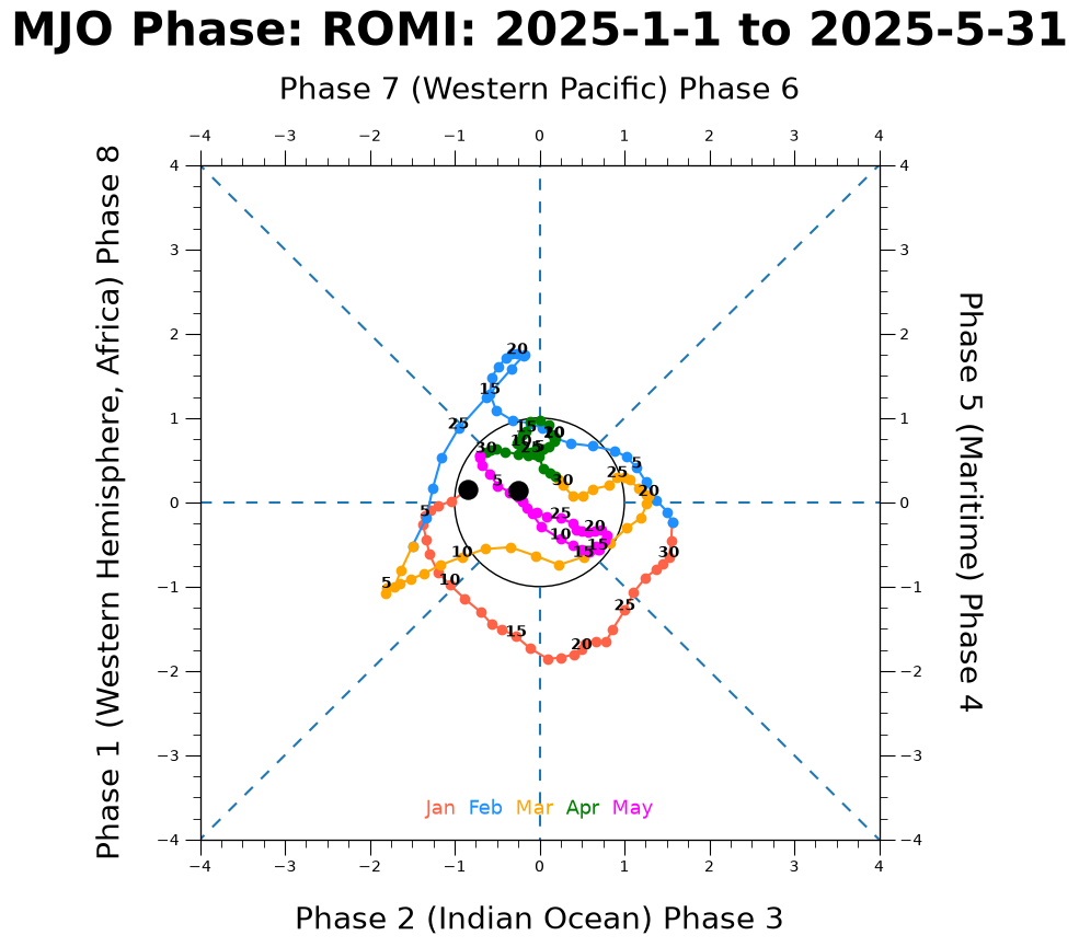
Plot Diagram for 2025#
Collect a subset of the data, the first five months of 2025.
df_2026 = noaa_df[(noaa_df["YYYY"] == 2025) & (noaa_df.MM.between(1, 5))]

df_2026
| YYYY | MM | DD | HH | RMM1 | RMM2 | Phase | |
|---|---|---|---|---|---|---|---|
| 12419 | 2025 | 1 | 1 | 0 | -0.15161 | -0.83951 | 0.85309 |
| 12420 | 2025 | 1 | 2 | 0 | -0.01538 | -1.03555 | 1.03566 |
| 12421 | 2025 | 1 | 3 | 0 | 0.04397 | -1.19613 | 1.19693 |
| 12422 | 2025 | 1 | 4 | 0 | 0.09447 | -1.28177 | 1.28524 |
| 12423 | 2025 | 1 | 5 | 0 | 0.16386 | -1.34737 | 1.35730 |
| ... | ... | ... | ... | ... | ... | ... | ... |
| 12565 | 2025 | 5 | 27 | 0 | 0.12277 | -0.03427 | 0.12746 |
| 12566 | 2025 | 5 | 28 | 0 | 0.06407 | -0.14853 | 0.16176 |
| 12567 | 2025 | 5 | 29 | 0 | -0.01231 | -0.20038 | 0.20076 |
| 12568 | 2025 | 5 | 30 | 0 | -0.06424 | -0.25173 | 0.25980 |
| 12569 | 2025 | 5 | 31 | 0 | -0.13798 | -0.25259 | 0.28782 |
151 rows × 7 columns
mjo_phase_plot(data=df_2026)
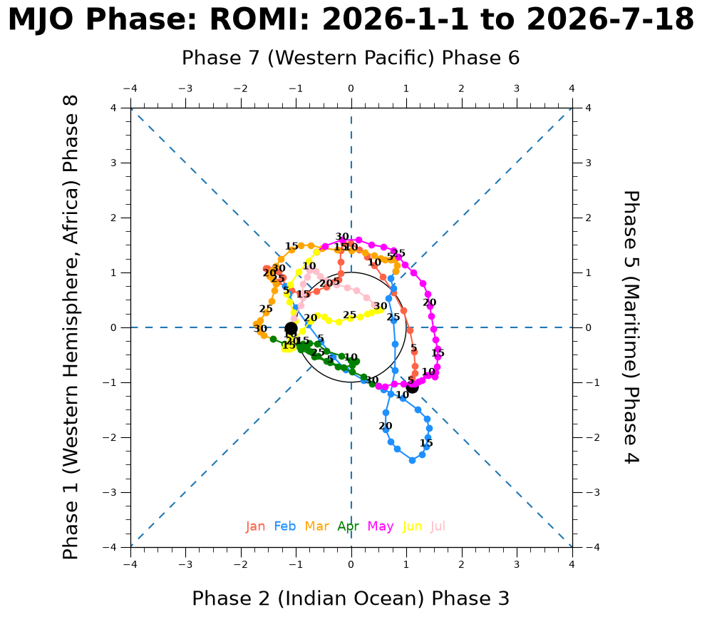
Plot Diagram Most Recent Data#
Display months of the most recent year.
all_years = noaa_df["YYYY"].unique()
most_recent_year = all_years[-1]
all_months_in_recent_year = noaa_df[(noaa_df["YYYY"] == most_recent_year)][
    "MM"
].unique()
print(
    f"Most recent year {most_recent_year} has {len(all_months_in_recent_year)} months"
)
Most recent year 2026 has 7 months
df_recent = noaa_df[(noaa_df["YYYY"] == most_recent_year)]
mjo_phase_plot(data=df_recent)
Curated Resources#
To learn more about Madden-Julian Oscillation: