Danica Lombardozzi (Jun 04 2021 at 18:39): Danica Lombardozzi (Jun 04 2021 at 18:39):
I would like to reorder a dataset from alphabetical to a specific order for plotting. I've used the reindex function, but this results in a plotting error. Plotting works fine without reordering, so it seems that something associated with using reindex. Why doesn't this work for plotting? Is there a better way to reorder a dataset?
Example code:
ds = df.set_index(['time', 'name'])[['co2']].to_xarray()
#Plotting works without this line, but out of order.
#Reindexing changes the order but results in error message about coordinates
ds = ds.reindex(name=["Mauna Loa", "Niwot Ridge", "Barrow"])

grouped = ds.groupby('name')
dsets = []
for site, dataset in grouped:
    g = dataset.groupby('time.year')
    r = (g.max() - g.min())
    dsets.append(r)
x = xr.concat(dsets, dim='name')

panel = ['(d)','(e)','(f)'] #to label panels
fig = plt.figure(figsize=(10,3))
plt.subplots_adjust(hspace=0.01, wspace=0.01)

for i in range(len(x.name)):
    ax = fig.add_subplot(1,3,i+1)
    data = x.co2[i,:]
    data.plot(color='black', label='observations')
Error message:
TypeError: Plotting requires coordinates to be numeric, boolean, or dates of type numpy.datetime64, datetime.datetime, cftime.datetime or pandas.Interval. Received data of type object instead.
Anna-Lena Deppenmeier (Jun 04 2021 at 18:40):Hi @Danica Lombardozzi , what do you want to reorder it by? I sort mine by time using this structure: ds_wdt_vmix_iso = ds_wdt_vmix_iso.sortby(ds_wdt_vmix_iso.time)
I've also had the plotting error before, it doesn't seem to recognize the axis against which to plot. Does something like this work plt.plot(data.name, data.*whateveryourvariableis*) ?
Danica Lombardozzi (Jun 04 2021 at 19:31):@Anna-Lena Deppenmeier , thanks for the suggestion. I challenge is that I'm trying to reorder by the site name, not something continuous like time. It's currently ordered alphabetically, but I want a specific (non-alphabetical) order.
The only thing that changes in the plotting is the order of the site names (which is also what the plotting is looping over -- one panel per site), so I don't think (or understand why) this should change anything about the plotting axes (time, co2).
Anna-Lena Deppenmeier (Jun 04 2021 at 19:33):it does plot before you reorder? I will say I don't think I understand your dataset and it is a bit hard for me to help without seeing what it looks like. can you paste the output of ds before and after reindexing?
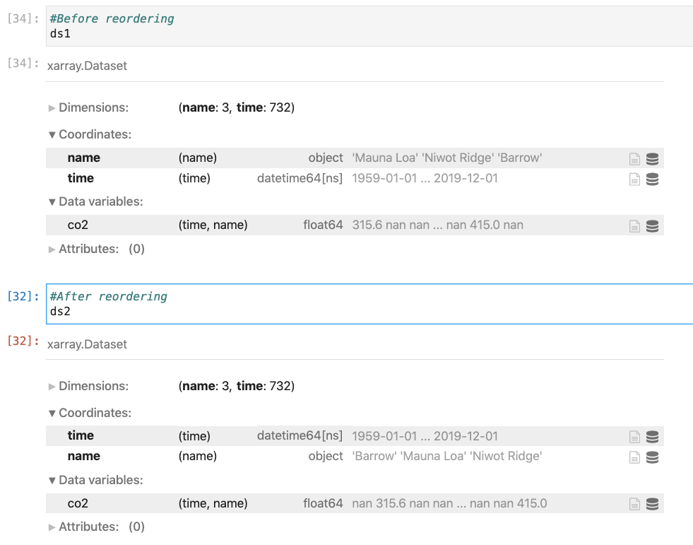
Danica Lombardozzi (Jun 04 2021 at 19:58):Yes, it does plot before I reorder. I'm attaching a screenshot of the dataset before and after reordering.
Screen-Shot-2021-06-04-at-1.57.32-PM.png
Anna-Lena Deppenmeier (Jun 04 2021 at 20:00):Sorry Danica, I can't help you. We need someone who knows more about xarray's plotting intricacies @Max Grover @Anderson Banihirwe @Deepak Cherian
Max Grover (Jun 04 2021 at 20:00):@Danica Lombardozzi could you share a code snippet (or a link to the data to the data you are working with?)
Danica Lombardozzi (Jun 04 2021 at 20:02):@Max Grover Does the code snippet at the top of this thread give you enough information? I'll paste it here, too, so you can see it more easily.
Example code:
ds = df.set_index(['time', 'name'])[['co2']].to_xarray()
#Plotting works without this line, but out of order.
#Reindexing changes the order but results in error message about coordinates
ds = ds.reindex(name=["Mauna Loa", "Niwot Ridge", "Barrow"])

grouped = ds.groupby('name')
dsets = []
for site, dataset in grouped:
    g = dataset.groupby('time.year')
    r = (g.max() - g.min())
    dsets.append(r)
x = xr.concat(dsets, dim='name')

panel = ['(d)','(e)','(f)'] #to label panels
fig = plt.figure(figsize=(10,3))
plt.subplots_adjust(hspace=0.01, wspace=0.01)

for i in range(len(x.name)):
    ax = fig.add_subplot(1,3,i+1)
    data = x.co2[i,:]
    data.plot(color='black', label='observations')
Error message:
TypeError: Plotting requires coordinates to be numeric, boolean, or dates of type numpy.datetime64, datetime.datetime, cftime.datetime or pandas.Interval. Received data of type object instead.
Max Grover (Jun 04 2021 at 20:02):It would be helpful to see what dataset you are working with - is it on glade?
Danica Lombardozzi (Jun 04 2021 at 20:08):It's one that I've created in my script from data on glade. The script I'm working with is here: /glade/work/dll/CTSM_py/notebooks/CO2Amplitude_ObsVsModel.ipynb
It's a little messy, but the relevant lines of code I pasted above are just below the markdown cells Obs data: Calculating amplitude for each site and Plotting amplitude time series. The dataset is created near the beginning of the script (well before the above code) under the markdown cell Looping over all observational sites to read in file
Max Grover (Jun 04 2021 at 20:47):@Danica Lombardozzi the following seemed to work for me
ds = df.set_index(['time', 'name'])[['co2']].to_xarray()
grouped = ds.groupby('name')
dsets = []
for site, dataset in grouped:
    g = dataset.groupby('time.year')
    r = (g.max() - g.min())
    dsets.append(r)
x = xr.concat(dsets, dim='name')

x.co2.plot(col='name', col_wrap=3)

panel = ['(d)','(e)','(f)'] #to label panels
fig = plt.figure(figsize=(10,3))
plt.subplots_adjust(hspace=0.01, wspace=0.01)

for i in range(len(x.name)):
    ax = fig.add_subplot(1,3,i+1)
   # Replaced x.co2[i, :] with this
    data = x.co2[:,i]
    data.plot(color='black', label='observations')
The main issue xarray/numpy runs into is that you are indexing co2 using (name, year) in the second to last line, instead of matching the dimensionality of the data (year, name). This switches when you set the index ['time', 'name'] in the first line! I hope this helps!!
Danica Lombardozzi (Jun 05 2021 at 01:41):Thanks @Max Grover ! I ran out of time to test this today, but I will test it out over the weekend. Good to know that the order of the indexing in the plotting loop was causing the problem.
Deepak Cherian (Jun 05 2021 at 18:51):This seems to do what you want
import numpy as np
import pandas as pd
import xarray as xr
import matplotlib.pyplot as plt


ds = xr.Dataset()
ds["co2"] = xr.DataArray(
    np.random.randn(3, 732),
    dims=("name", "time"),
    coords={
        "name": np.array(["Barrow", "Mauna Loa", "Niwot Ridge"], dtype=object),
        "time": pd.date_range("1959-01-01", "2019-12-01", periods=732),
    },
)
ds = ds.reindex(name=["Mauna Loa", "Niwot Ridge", "Barrow"])

# Specify "time" in min, max so that the "name" dimension is preserved
x = ds.groupby("time.year").map(lambda g: g.max("time") - g.min("time"))
x.co2.plot(col="name")  #  'facet' using the 'col' kwarg
Xarray makes this kind of plotting really easy. See the docs for more on "faceted" plots or subplots.
Danica Lombardozzi (Jun 07 2021 at 18:06):Thanks @Deepak Cherian ! This works to plot the observations in the order I'd like them. However, I want to also overlay values from CESM simulations (3 lines per plot), which are in a python dictionary and I can't figure out how to overlay the dictionary values properly since I can't specify CESM2dictionary.co2.plot for a dictionary (I'm still relatively new to python and plotting).
I also don't understand the what the .map(lambda g: ... ) does (or why it's needed). It works, but if you can help me to understand what it's doing, I'd appreciate it!
The fix that @Max Grover shared works solve the plotting error I was getting, but the values are not plotting in the order I specified using the reindex function.
Deepak Cherian (Jun 07 2021 at 18:12):map is described here . It lets you apply a custom function to each group individually and concatenates the results back together (which is what you were doing with that for loop). Your custom function will receive an xarray object corresponding to each group (here for each year)
What does your dictionary look like?
If you save the returned object from plot
fg = x.co2.plot(col="name")
then fg.axes will give you the actual axes for the plots in the figure. So you can always plot to those and make more complicated figures.
Danica Lombardozzi (Jun 07 2021 at 18:56):Thanks for the info on map -- I'll have to play with it to understand it better. I was able to figure out the plotting, too. I appreciate your help!
Last updated: May 16 2025 at 17:14 UTC