Stephen Yeager (Dec 31 2020 at 18:17): Stephen Yeager (Dec 31 2020 at 18:17):
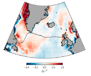
Can anyone share an example of how to use matplotlib with cartopy to generate a regional conic projection plot like the attached?
plot_example.png
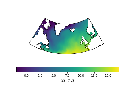
Elizabeth Maroon (Jan 02 2021 at 22:17):Here's a solution with a time slice of POP SST, though it's a bit hacky. Had to pre-trim the data to approximately fit the region bounds to get the regional map to fill the figure. Would love to know if there's a way to do this that doesn't require pre-trimming.
import cartopy.crs as ccrs
import matplotlib.pyplot as plt
from matplotlib.path import Path
import xarray as xr
import numpy as np

lonw=-80; lone=20; lats=45; latn=70 #corners for conic projection
xw=50; xe=175; ys=312; yn=380       #for trimming POP data to region

sst=ds['SST'].roll(nlon=100).isel({'nlat':slice(ys,yn),'nlon':slice(xw,xe)})
tlong=sst['TLONG']
tlat=sst['TLAT']

ax=plt.axes(projection=ccrs.LambertConformal(central_longitude=(lonw+lone)/2, \
                                             central_latitude=(lats+latn)/2))  #AlbersEqualArea also works

sbnd=[[ee,lats] for ee in np.arange(lonw,lone,1)]  #make vertices for regional map boundary
nbnd=[[ww,latn] for ww in np.arange(lone,lonw,-1)]
verts=sbnd+nbnd
path=Path(verts)
ax.set_boundary(path, transform=ccrs.PlateCarree()) #reset projection boundary

plt.pcolormesh(tlong, tlat, sst, transform=ccrs.PlateCarree())
ax.coastlines()
cb=plt.colorbar(orientation='horizontal', label='SST ($^{\circ}$C)')
GridSpec can be used to adjust the colorbar size relative to the map.
almostconic.png
Stephen Yeager (Jan 03 2021 at 16:59):Thanks Liz. This is a good workaround, but I agree that it's quite awkward to have to pre-trim the data.
Last updated: May 16 2025 at 17:14 UTC