Danielle Touma (Jun 30 2022 at 17:31): Danielle Touma (Jun 30 2022 at 17:31):
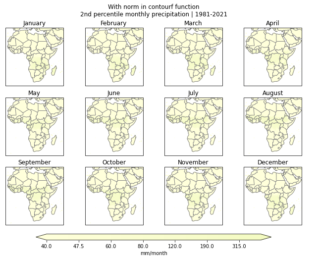
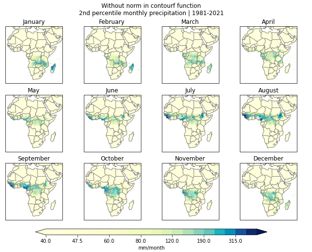
Hi, I am plotting some precipitation data using the contourf function, and I am trying to specify specific levels for the contours. I am essentially trying to get the same functionality as NCL's ExplicitLevels. However, I can't seem to get it to use the colormap and contour levels in the correct way. In the first way, I am getting it to use the whole colormap but instead of using the contour levels in a proportional way with the colormap, it is still putting the lower values closer together on the colormap. In the second way, I use the BoundaryNorm function to get it to match the contour levels correctly to the colormap, but it is only using the first few colors of the colormap. Does anyone know what could be going on and how to get it to work properly? Any help is appreciated.
This is the code. In the first way, I remove the "norm" argument in the contourf function, and in the second way, the "norm" argument is included. I have included the output in the attached images.
clevs0 = [0,2.5,5,7.5,10,15,20,25,30,40,50,60,80,100,125,150,175,225,275,350,400]
clevs = [x+40 for x in clevs0]
norm = BoundaryNorm(clevs, ncolors=len(clevs)+1, extend='both')

fig, ax = plt.subplots(3,4,figsize=(11,8.5),subplot_kw={'projection': ccrs.PlateCarree()})
ax = ax.flatten()
ax_count = 0
xx=0

for mm in range(0,12,1):
    cs = ax[ax_count].contourf(lon,lat,pr_pxx[xx,mm,...].where((pr_pxx[xx,mm,...]<5000)&(pr_pxx[xx,mm,...]>=0)),
                               clevs, cmap='YlGnBu',  extend='both',  norm=norm,
                               transform = ccrs.PlateCarree())
    ax[ax_count].add_feature(cfeature.BORDERS, edgecolor='grey')
    ax[ax_count].coastlines(color='grey')
    ax[ax_count].set_title(cd.month_name[mm+1])
    ax_count += 1

fig.subplots_adjust(bottom=0.25, top=0.9, left=0.1, right=0.9, wspace=0.05, hspace=0.2)
cbar_ax = fig.add_axes([0.2, 0.2, 0.6, 0.02])
cbar=fig.colorbar(cs, cax=cbar_ax,orientation='horizontal')
cbar.set_label('mm/month')
fig.suptitle('2nd percentile monthly precipitation\n' + str(year0) + '-' + str(year1))
with_norm.png
without_norm.png
Anissa Zacharias (Jun 30 2022 at 17:49):Hi Danielle, I can take a look at this! Is it possible for you to send over or point me to the location of the data you're using to make the plots?
Matt Long (Jun 30 2022 at 17:50):You might try a different value for ncolors in the BoundaryNorm—try setting this to 256, for example, and see what happens.
Danielle Touma (Jun 30 2022 at 17:58):Thanks for the offer, @Anissa Zacharias , but @Matt Long 's suggestion worked! Matt, if you have a moment, could you help me understand why? When I tried going a bit more extreme (ncolors=500), it seems like it extended the color bar by stretching out the darker colors. I am mystified :thinking:
Anissa Zacharias (Jun 30 2022 at 17:58):Glad to hear it!
Matt Long (Jun 30 2022 at 18:00):I am not entirely sure, but ncolors refers to the number of colors in the colormap—which you would think should be the number of levels, but it is apparently not.
https://matplotlib.org/stable/api/_as_gen/matplotlib.colors.BoundaryNorm.html
Danielle Touma (Jun 30 2022 at 18:03):Yes, I was under the impression that it is the number of levels based on examples I was seeing in the matplotlib docs, but it also makes sense that it would be the number of colors in the colormap. So maybe when you put a number that does not match, it tries to subset or extend the colormap. Thanks!
Ryan May (Jul 01 2022 at 16:37):According to the Matplotlib docs, ncolors is: "Number of colors in the colormap to be used." As in, the number of colors used from the target colormap. If you have a particular colormap cmap you want to pair this with, you can use cmap.N.
Last updated: May 16 2025 at 17:14 UTC