Mira Berdahl (Mar 07 2022 at 17:15): Mira Berdahl (Mar 07 2022 at 17:15):
Hi,
I'm trying to draw a polygon or even just a simple line along a specified latitude on a global map. This is simply for visualizing regions, not for computation. What is the most straightforward way to do this? None of my searching online has been particularly helpful.
Thanks!
Mira
Brian Bonnlander (Mar 07 2022 at 17:24):Hi Mira! Here is a collection of plotting examples that may help.
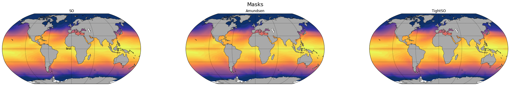
Mira Berdahl (Mar 07 2022 at 19:36):Thanks Brian! I gave this a try, but for some reason the polygon won't display, only the text. Also, the text doesn't seem to shift when I move the x,y location, it always just appears at the center of the map. I wonder if it has something to do with my projection....
import cartopy.crs as ccrs
import cartopy

test = (Annual_OceanT_H11.isel(time=10,z_t=0))
lat = mfds_fix.TLAT
lon = mfds_fix.TLONG

lo = -5.
hi = 30.
dc = 1
cnlevels = np.arange(lo, hi+dc, dc)
cnlevels


fig, axs = plt.subplots(nrows=1, ncols = 3, figsize = (26,4), subplot_kw=dict(projection=ccrs.Robinson()))
#fig, axs = plt.subplots(nrows=1, ncols = 3, figsize = (26,4), subplot_kw=dict(projection=ccrs.SouthPolarStereo()))


axs[0].coastlines(lw=0.2)
axs[0].contourf(lon,lat, test, transform = ccrs.PlateCarree(), add_colorbar=True, levels = cnlevels, extend = 'neither',  cmap=cmocean.cm.thermal)
axs[1].contourf(lon,lat, test, transform = ccrs.PlateCarree(), add_colorbar=False, levels = cnlevels, extend = 'both',   cmap=cmocean.cm.thermal)
axs[2].contourf(lon,lat, test, transform = ccrs.PlateCarree(), add_colorbar=False, levels = cnlevels, extend = 'both',   cmap=cmocean.cm.thermal)
axs[0].set_global()
land = axs[0].add_feature(cartopy.feature.NaturalEarthFeature('physical', 'land', '110m',linewidth=0.5, edgecolor='black', facecolor='darkgray'))
land = axs[1].add_feature(cartopy.feature.NaturalEarthFeature('physical', 'land', '110m',linewidth=0.5, edgecolor='black', facecolor='darkgray'))
land = axs[2].add_feature(cartopy.feature.NaturalEarthFeature('physical', 'land', '110m',linewidth=0.5, edgecolor='black', facecolor='darkgray'))


fig.suptitle('Masks', fontsize = 18, y=0.999)
fig.tight_layout()
axs[0].set_title('SO')
axs[1].set_title('Amundsen')
axs[2].set_title('TightSO')
axs[0].gridlines(color='black', alpha=0.5, linestyle='--')
axs[1].gridlines(color='black', alpha=0.5, linestyle='--')
axs[2].gridlines(color='black', alpha=0.5, linestyle='--')

# Create a rectangle patch, to color the border of the rectangle a different color.
# Specify the rectangle as a corner point with width and height, to help place border text more easily.
left, width = -90, 45
bottom, height = 10, 30
right = left + width
top = bottom + height

# Draw rectangle patch on the plot
p = plt.Rectangle(
    (left, bottom),
    width,
    height,
    fill=False,
    zorder=3,  # Plot on top of the purple box border.
    edgecolor='black',
    alpha=0.5)  # Lower color intensity.
axs[0].add_patch(p)


# Draw top text
# axs[0].text(left + 0.6 * width,
#     top,
#         'test',
#         horizontalalignment='right',
#         verticalalignment='center')

axs[0].text(120,120,
        'test',
        horizontalalignment='right',
        verticalalignment='center')
I think I've seen this behavior before. The plot commands have a "transform" parameter that you should find in the example. This tells the plotting function what projection (or you could also say coordinate system) your point values are in. You have the option of considering the lower left corner of the plot as having coordinate (0,0) and the top right corner being at (1,1). To specify lat/lon values, I think "PlateCarree" is the right transform.
Mira Berdahl (Mar 07 2022 at 20:00):This did the trick! Thanks so much Brian.
Last updated: May 16 2025 at 17:14 UTC