Danica Lombardozzi (Jan 14 2021 at 21:00): Danica Lombardozzi (Jan 14 2021 at 21:00):
Does anyone have experience creating a scatter plot using data in a dictionary?
I've tried plotting variables from two separate dictionaries (with the same keys and number of values), and plotting two different values from within a single dictionary (each key has an x and a y value) but can't seem to figure out how to create a plot. If anyone has ideas or an example, I'd really appreciate it!
Brian Medeiros (Jan 14 2021 at 21:26):Hi Danica, I think I know how to do that in either case, but I do end up having to use the keys() and values() methods on the dictionary.
If you have one dictionary with keys being the x-points and values being the y-points, then you could just do something like
plt.scatter(your_dict.keys(), your_dict.values())
(As long as both keys and values are numeric types.)
In the case where you might have two dicts that have the same keys and different values, here's an example:
import numpy as np
import matplotlib.pyplot as plt

keyvals = np.array([1000, 925, 850, 700, 500, 400, 300, 250, 200, 150, 100, 70, 50, 30, 20, 10, 7, 5, 3, 2, 1])
dict1 = {k: np.random.randn() for k in keyvals}
dict2 = {k: np.random.randn() for k in keyvals}

fig, ax = plt.subplots()
ax.scatter(dict1.values(), dict2.values())
ax.set_xlabel("DICT1")
ax.set_ylabel("DICT2")
In this case the keys are numbers, but they didn't need to be, they could well have been strings.
Does this help? Maybe I didn't understand your question.
Brian Medeiros (Jan 14 2021 at 21:33):Oh, in case each key in the dictionary has values that are a sequence, you could loop through to get the ones you want like this, where each key points to a list of values, and then I plot the 6th value of the lists from each dictionary's matching key against each other.
keyvals = np.array([1000, 925, 850, 700, 500, 400, 300, 250, 200, 150, 100, 70, 50, 30, 20, 10, 7, 5, 3, 2, 1])
dict1 = {k: np.random.randn(10) for k in keyvals}
dict2 = {k: np.random.randn(10) for k in keyvals}

special_index = 5
fig, ax = plt.subplots()
for k in dict1.keys():
    ax.plot(dict1[k][special_index], dict2[k][special_index], marker='o')
ax.set_xlabel("DICT1")
ax.set_ylabel("DICT2")
Danica Lombardozzi (Jan 14 2021 at 21:51):Thanks so much @Brian Medeiros ! This was super helpful, and I was able to make the plot I wanted!
scatter.png
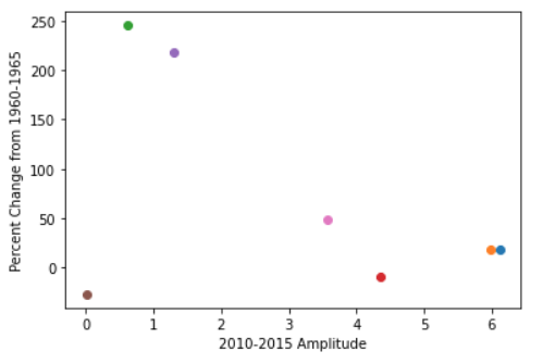
Danica Lombardozzi (May 10 2021 at 16:41):Is there a straightforward way to change the sequence colors in a scatter plot like this example? I've unsuccessfully tried several different methods. The below code plots the figure with default colors
fig, ax = plt.subplots()
for k in nbp_mean.keys():
    ax.plot(nbp_mean[k], pct_diff[k], marker='o')
    ax.errorbar(nbp_mean[k], pct_diff[k], xerr=nbp_std[k], linestyle="None", color='lightgray', linewidth=2)
ax.set_ylabel("Change [%]")
ax.set_xlabel("2010-2015 Mean [ppm]")
I'd like to change the colors so that I can set the observation (last data point) to black. I've made several attempts to manually change point colors through changing code in the ax.plot line, with error messages each time. Examples of the changes to this line (and various attempts at coding RBG values correctly) include:
colors=['slateblue','seagreen','peru','indianred','black']
colors_RBG={'106-90-205', '46-139-87', '205-133-63', '205-92-92', '0-0-0'}
#colors_RBG={'10690205', '4613987', '20513363', '2059292', '000'}
#colors_RBG=[(106,90,205),(46,139,87),(205,133,63), (205,92,92), (0,0,0)]

ax.plot(nbp_mean[k], pct_diff[k], marker='o', color=colors)
ax.plot(nbp_mean[k], pct_diff[k], marker='o', color=colors[k])
ax.plot(nbp_mean[k], pct_diff[k], marker='o', color=colors_RBG)
ax.plot(nbp_mean[k], pct_diff[k], marker='o', color=colors_RBG[k])
I can change so that all points have the same color (color='black'), but I want each point to be a different color. Each of the above lines results in an error (RGBA sequence should have length 3 or 4; list indices must be integers or slices, not str; 'set' object is not subscriptable).
How can I change the sequence of colors so that I can specify the color for each point?
Matt Long (May 10 2021 at 16:57):@Danica Lombardozzi , I take it that nbp_mean[k] is a vector?
Does this help?
# generate pseudo data
x = np.arange(10)
y = x**2

# get default color sequence
colors = plt.rcParams['axes.prop_cycle'].by_key()['color']

# loop over data and plot each point
for xi, yi, color in zip(x, y, colors):
    plt.plot(xi, yi, '.', color=color)
Danica Lombardozzi (May 10 2021 at 17:33):Thanks @Matt Long . npb_mean and pct_diff are dictionaries. In the example you share, I don't quite understand how to include the colors in the for loop while looping over the dictionary.
Matt Long (May 10 2021 at 17:34):is this what you are looking for?
x, y = nbp_mean[k], pct_diff[k]
for xi, yi, color in zip(x, y, colors):
    plt.plot(xi, yi, '.', color=color)
Deepak Cherian (May 10 2021 at 17:36):I think the confusion is arising because colors is not a dictionary, but it probably should be.... It's at least being treated like a dictionary ax.plot(nbp_mean[k], pct_diff[k], marker='o', color=colors[k])
Also colors_RGB is a set which looks like a typo {} instead of [].
Danica Lombardozzi (May 10 2021 at 17:51):Thanks! Changing colors to a dictionary did the trick!
Last updated: May 16 2025 at 17:14 UTC