Kristen Krumhardt (Jan 27 2021 at 14:08): Kristen Krumhardt (Jan 27 2021 at 14:08):
Hi all, I recently ran my BGC diagnostics notebook on year 30 of the JRA run. You can view it here:
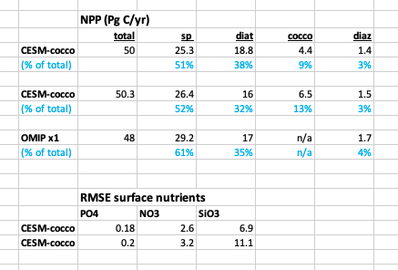
My major concern after seeing these results is the positive bias in surface SiO3. I was hoping that the PFT-related tunings from the x1 would translate better to the x0.1. Unfortunately the diatoms really took a hit, as they are being quite outcompeted by coccos, most notably in the North Pacific. This surprises me because the North Pacific was always the last place coccos would show up when tuning in the x1. In the real world, diatoms and coccolithophores both flourish in the North Pacific. Diatoms in the Southern Ocean are also being outcompeted by small phytos in the Antarctic zone. Globally, the diatoms account for ~ 32% of NPP but this still isn’t enough, as is reflected in the positive SiO3 bias at the surface (diatoms account for 38% of NPP in the x1 version).
Globally integrated NPP is reasonable at 50 Pg C/yr.
Globally integrated calcification is within observation boundaries.
Total N fixation is within observation boundaries (yet P-limitation is still quite extensive for small phytos; I was expecting more N limitation).
Global POC export is a bit low at 5.7 Pg C/yr.
I made a couple summary tables comparing this run to the x1 version of CESM-cocco with JRA forcing and the OMIP run. Here is a snapshot:
Please let me know if you would like to see anymore plots.
Yassir Eddebbar (Mar 16 2021 at 19:43):This is a great notebook @Kristen Krumhardt, would it be ok if I take snippets from these to look at the O2 and velocity solution?
Kristen Krumhardt (Mar 16 2021 at 20:18):Of course! :)
Michael Levy (May 22 2021 at 01:18):@Keith Lindsay I have an almost-complete set of steps for you to take to see the latest plots in a dashboard:
interactive_notebookhires-marbl environment and then add panelify to it with pip install git+https://github.com/andersy005/panelify.gitjupyter lab on casper (I think cheyenne will work too, since nothing is on campaign), open Interactive_Dashboard.ipynbIn [2], change paths to paths = ("/glade/work/mlevy/hi-res_BGC_JRA/analysis/notebooks/images/g.e22.G1850ECO_
JRA_HR.TL319_t13.004/",)
In [3], comment out the .drop(columns="Unnamed: 0") portion of the pd.read_csv() call
[6], add "time_period",to the create_dashboard call for time_series# Create the timeseries dashboard
time_series = panelify.create_dashboard(
keys=[
"casename",
"varname",
+ "time_period",
],
At this point, I can run the notebook, click on the "Time Series" tab of the dashboard, and choose 0018-01-01_0034-12-31 for "Time Period" but the plot itself doesn't update (and nothing happens if I change variables, either). I'm hoping @Max Grover or @Anderson Banihirwe can chime in with steps to take to actually update the images being displayed or maybe it'll just work for you :)
We currently only have "Summary Map" plots for year 1, but next week I'll generate them for years 2-34 and update the PNG catalog -- I don't think you'll need any source mods to display those additional plots, the "Date" slider should just get a little longer
Last updated: May 16 2025 at 17:14 UTC