Justin Richling (Jun 29 2023 at 17:11): Justin Richling (Jun 29 2023 at 17:11):
Hello,
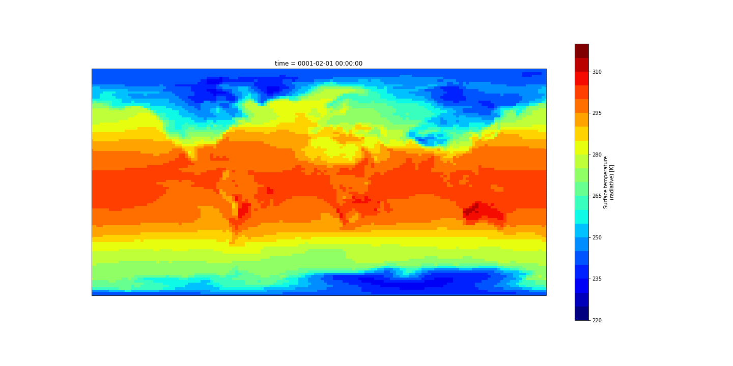
I have a question about setting a central longitude argument in the xarray native dataset plotting feature. I'm using CAM output data:
# Xarray native plotting

ts = ds['TS'].sel({'time':ds.TS.time.values[0]}).squeeze()

fig, ax = plt.subplots(1,figsize=(20,10))

ts.plot.contourf(cmap="jet",levels=np.arange(220,321,5))
By default this will plot globally with the central longitude at 180. I am trying to change the central longitude specifically using xarray's built-in plotting function, which I believe runs matplotlib in the background.
I know of a way to change the central longitude using matplotlib explicitly, but also have to use the cyclic point to avoid the white line jump in the plot:
from cartopy.util import add_cyclic_point
lon_idx = ts.dims.index('lon')
wrap_data, wrap_lon = add_cyclic_point(ts.values, coord=ts.lon, axis=lon_idx)
lat = ts.lat

fig = plt.figure(figsize=[20,10])
ax = fig.add_subplot(1, 1, 1, projection=ccrs.PlateCarree(central_longitude=0))

ax.contourf(wrap_lon,lat,wrap_data,cmap="jet",levels=np.arange(220,321,5),transform=ccrs.PlateCarree())
But I was hoping to keep it strictly to using the xarray ts.plot.contour. I know there are some subplot kwargs one can send to the xarray plot, so I tried:
# Xarray native plotting

ts = ds['TS'].sel({'time':ds.TS.time.values[0]}).squeeze()

fig, ax = plt.subplots(1,figsize=(20,10))

ts.plot.contourf(cmap="jet",levels=np.arange(220,321,5),subplot_kws={"projection":ccrs.PlateCarree(central_longitude=0)})
But it didn't change the plot, nor did it give an error or warning...
Anyone know how/if this can be done?
Katie Dagon (Jun 29 2023 at 17:15):@Justin Richling can you point to your data file location? I'd like to try this out since I'd also expect setting central_longitude to work
Justin Richling (Jun 29 2023 at 17:16):Thanks @Katie Dagon
/glade/scratch/hannay/archive/b1850_high_freq/atm/hist/b1850_high_freq.cam.h0.0001-01.nc
Katie Dagon (Jun 29 2023 at 17:37):This is an interesting use case. I sort of got this to work by removing the fig, ax definition and setting everything in the .plot command, but you also have to remove the .contourf to avoid the white line jump. But at least this way, the central_longitude is recognized in the xarray plot call.
ts = ds['TS'].sel({'time':ds.TS.time.values[0]}).squeeze()
ts.plot(figsize=(20,10), cmap="jet", levels=np.arange(220,321,5), subplot_kws={"projection": ccrs.PlateCarree(central_longitude=0)})
Nice sleuth work!
This is interesting, however, after trying your snippet I am getting a cannot use subplot_kws with existing ax error. Is there something maybe I'm missing? It plots if I leave out the figsize argument, but then it won't adjust the central longitude :worried: .
I'm using xarray version 2022.6.0. Can you check which version you were using? Thanks again.
Katie Dagon (Jun 29 2023 at 20:48):I'm using 2022.11.0. Did you delete the fig, ax = plt.subplots(1,figsize=(20,10)) line and remove those variables? I think I got the same error before I removed that.
Justin Richling (Jun 29 2023 at 21:11):I did and still no avail... I wonder if it's the different version of xarray?
I can get a hack to work with pulling the figsize out and making a fig object and then add a transform argument in the xarray plot call:
ts = ds['TS'].sel({'time':ds.TS.time.values[0]}).squeeze()
fig = plt.figure(figsize=(20,10))
ts.plot.contourf(cmap="jet", levels=np.arange(220,321,5),transform=ccrs.PlateCarree(),
                subplot_kws={"projection": ccrs.PlateCarree(central_longitude=0)},
                )
But It loses the nice formatting of the axis and colorbar size/location that native xarray plotting gives, which I guess is a minor grievance. And it does loose the contour fill look.
Katie Dagon (Jun 29 2023 at 21:26):Great! Though it looks like if you switch to central_longitude=0 with that code you posted above, the white line does reappear. I think this is a side effect of using .contourf, which is why the white space doesn't show up with the built in .plot which uses pcolormesh (I think).
And I see what you mean about the axis/colorbar formatting. xarray's built-in plotting is great , but I usually switch over to cartopy/matplotlib if I want to make things more customized, especially with map projections. But this could be a great area for future contributions to xarray!
Justin Richling (Jun 29 2023 at 21:29):Yeah, I jumped the gun without looking at my code and had to update my comment :/
This should be enough for the time being, I was just trying to keep it simple and contained example of xarray plotting, but I guess I'll lean a little more on the matplotlib helpers. Thanks for the help Katie!
Hendrik Grosselindemann (Jun 29 2023 at 21:29):You can do colorbar formatting in the xarray plotting call by giving cbar_kwargs to it:
cbar_kwargs={
'label':'absolute velocity [$m\,s^{-1}$]','ticks':np.arange(0,2.2,0.2),
'orientation':'horizontal','aspect':40,'pad':0.06
}
Brian Bonnlander (Jun 29 2023 at 21:34):This notebook might have some helpful pointers; it uses color interpolation, which may erase the vertical line:
Deepak Cherian (Jul 03 2023 at 16:30):Xarray just dispatches to matpotlib/cartopy though. Does this help? I was ocnfused for a long time till I realized that you need to specify two things:
projection passed to the axes creation function (in plt.figure or plt.axes or as subplot_kws which is passed on to plt.subplots), and transform (usually PlateCarree). Deepak Cherian (Jul 03 2023 at 16:31):Here's a tutorial with minimal text
Last updated: May 16 2025 at 17:14 UTC