Daniel Marsh (Jul 21 2021 at 17:09): Daniel Marsh (Jul 21 2021 at 17:09):
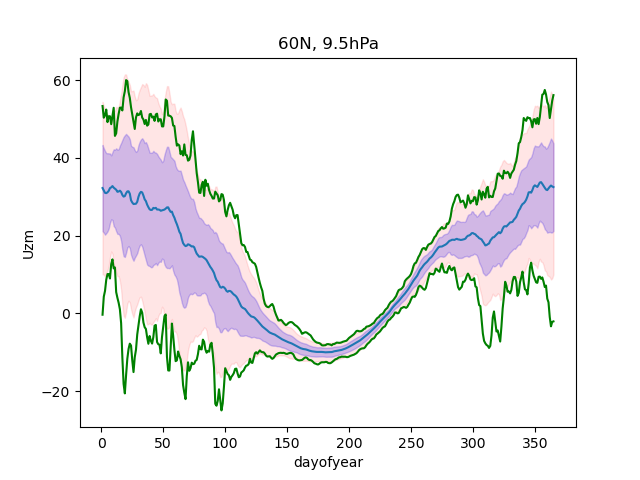
Hi all, I was wondering if anyone has already dealt with this issue. I have data grouped by and averaged by day of year (0 to 364). I am plotting it's mean, +/-std, +/-2std and max and min. I was wondering if anyone has suggestions about how to shift the time axis to begin July 1 and replace dayofyear with month in the x-axis labels. I could brute force it by plotting vs. doy2 = np.mod((doy+180),365) but that causes wrapping artifacts in the plot that I can deal with but it's not elegant. Here's the current figure:
u60n.png
Daniel Marsh (Jul 21 2021 at 17:16):I am hoping to create something like this: u60n_10_2021_merra2.pdf
Deepak Cherian (Jul 21 2021 at 17:36):Use .roll to move the data in a circular fashion. I think you'll have to manually set the xaxis labels or create a fake time axis using xr.cftime_range and plot against that.
Deepak Cherian (Jul 21 2021 at 17:37):longer term: I think we should consider making ClimatologyTimeIndex that we can plug in to xarray for things like this. cc @xdev
Daniel Marsh (Jul 21 2021 at 21:00):Thanks - rolling the data and creating a new time axis 'days from July 1' should work. I will look into manually setting x-axis labels to the month names.
Last updated: May 16 2025 at 17:14 UTC