Plot a global map from spectral element with regional refinement (SE-RR) mesh field (Plot_2D application)
# By line: DSJ 10-MAR-2021
# Script aims to:
# - Plot a world map from SE-RR mesh
# - Add a grid line
# - Plot a regional map
# - Change longitude interval and add state lines
# - Add unit and title, and change maximum value of the plot
At the start of a Jupyter notebook you need to import all modules that you will use
# Make sure you have downloaded "Plot_2D.py" script from Github
from Plot_2D import Plot_2D
import xarray as xr # To read NetCDF file
import matplotlib.cm as cm # To change colormap used in plots
Read the sample file
# Make sure you have downloaded "sample_se.nc" and "sample_se_scrip" files from Github
ds = xr.open_dataset( 'sample_se.nc' )
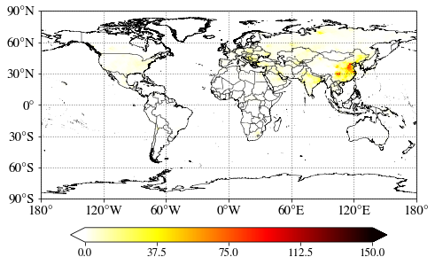
Call Plot_2D script to plot surface SO2
Note that you must specify scrip file to let the script know what mesh looks like
# multiply by 1e9 to make it to ppbv
Plot_2D( ds['SO2'][0,-1,:]*1e9, scrip_file='sample_se_scrip.nc', cmap=cm.hot_r )
<Plot_2D.Plot_2D at 0x17be2243508>
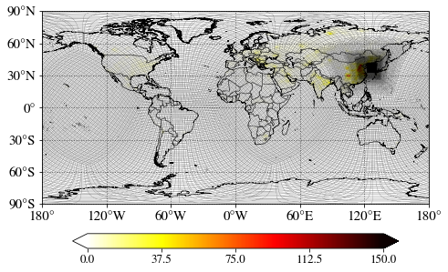
Add a grid line to see the model mesh
# multiply by 1e9 to make it to ppbv
Plot_2D( ds['SO2'][0,-1,:]*1e9, scrip_file='sample_se_scrip.nc', cmap=cm.hot_r, grid_line=True, grid_line_lw=0.1 )
<Plot_2D.Plot_2D at 0x17ba18bb908>
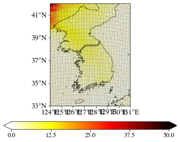
Let’s plot a regional map
# multiply by 1e9 to make it to ppbv
Plot_2D( ds['SO2'][0,-1,:]*1e9, scrip_file='sample_se_scrip.nc', cmap=cm.hot_r, grid_line=True, grid_line_lw=0.1, lon_range=[124,131], lat_range=[33,42] )
<Plot_2D.Plot_2D at 0x17c0ed5af48>
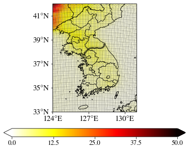
Let’s change the interval of longitude labels and add state lines
# multiply by 1e9 to make it to ppbv
Plot_2D( ds['SO2'][0,-1,:]*1e9, scrip_file='sample_se_scrip.nc', cmap=cm.hot_r, grid_line=True, grid_line_lw=0.1, lon_range=[124,131], lat_range=[33,42], lon_interval=3, state=True )
<Plot_2D.Plot_2D at 0x17c2d5d8148>
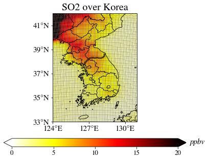
Add unit and title, and change maximum value of the plot
# multiply by 1e9 to make it to ppbv
Plot_2D( ds['SO2'][0,-1,:]*1e9, scrip_file='sample_se_scrip.nc', cmap=cm.hot_r, grid_line=True, grid_line_lw=0.1, lon_range=[124,131], lat_range=[33,42], lon_interval=3, state=True, unit='ppbv', title='SO2 over Korea', cmax=20 )
<Plot_2D.Plot_2D at 0x17c5c0dfcc8>