Chapter 9: Walk-thru Recipes
Recipe 1: Preparing Hydro-climate Inputs for Climate Change in Water Resource Planning
Problem Statement: You have been asked to prepare temperature and precipitation future climate data inputs for general use in impact models for climate change impacts, such as:
Surface water hydrology
Crop irrigation water requirements
Inland water temperature
Sediment transport
Long term planning of water resources
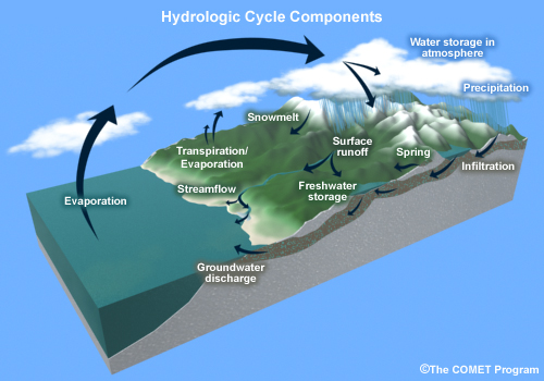
Climate changes, particularly changes in temperature and precipitation, have a direct impact on two key elements of the hydrologic cycle: evaporation and precipitation. Other elements of the hydrologic cycle—snowmelt, runoff, surface streamflow, and storage—are consequently impacted. We will focus on the development of temperature and precipitation inputs (focusing on amount, not phase) that can be used for modeling the other elements of the hydrologic cycle.
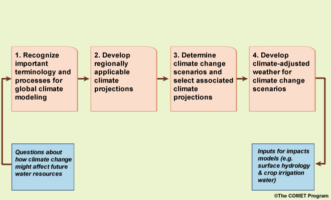
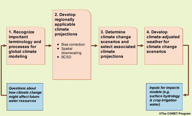
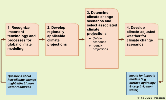
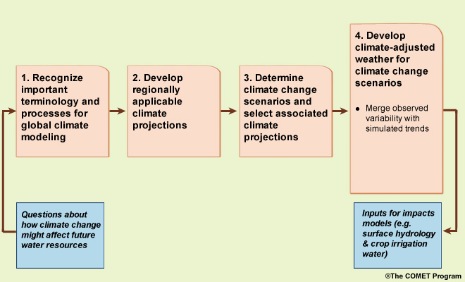
The process presented here includes four main steps. We start with questions about how climate change might affect future water resources. Then, the first step is to develop a basic recognition of key terminology and processes for global climate modeling, much of which we covered earlier in this primer, but review key terms here. Then we develop regionally applicable climate projections, determine climate change scenarios and select associated climate projections to inform them, and finally develop “climate-adjusted weather” inputs for each of the climate change scenarios. This last step will result in the inputs for models that simulate future impacts on surface hydrology and crop irrigation requirements.
It is important to remember that this process is just one way to prepare climate change impacts. There are a number of other methods, each with their own strengths and weaknesses.
STEP 1. Climate Terms
Useful terms and acronyms in the Glossary will be important to understand as we go through this case study.
STEP 2. Develop Regionally Applicable Climate Projections
In this STEP2, we will process coarse-scale ESM projection data to make it more relevant for regional applications. Specifically, we will focus on developing regionally applicable climate projection data through bias correction, and downscaling. We will be using the Bias-Correction and Spatial Downscaling methodology, or BCSD. This method has been applied to the multi-model data set represented in the IPCC Assessment Report 4, AR4 (noting that the most recent report is IPCC Assessment Report 4, AR6).
Model Resolution Considerations
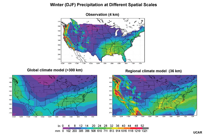
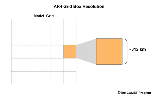
In this graphic of December–January–February precipitation, the observations are used to produce a high spatial resolution 4-km grid. ESM precipitation is at a coarser grid, equivalent to gridboxes greater than 312 km on each side (this is typical for AR4, noting that typical AR6 model resolutions are higher, roughly ½ of this). This is too coarse to adequately resolve even some of the larger drainage basins, particularly where orographic effects impact precipitation distribution. Through a process called downscaling we can create higher spatial resolution, 36-km, for ESM precipitation.
Requirements for local assessments of hydrology and crop water demands:
Model biases removed
Short time steps
High spatial resolution
Local assessments of hydrology and crop irrigation requirements ideally require climate information in which there are no model biases. In addition, many regional assessments require data that are output in short time steps, with high spatial resolution to represent relatively local regions.
There are trade-offs in confidence when global model output is regenerated with high spatial resolution. The questions you are trying to address should guide your requirements. In this case study, we will take ESM data, bias-correct it, and downscale it to 1/8° with monthly and daily time steps, appropriate for specific watershed areas.
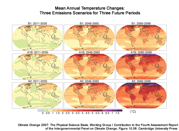
Although ESMs produce high temporal resolution output, such as daily timesteps, these are not meant to be guidance for specific events. Rather the simulation results are intended to be more reliable when expressed statistically over longer time periods. Here we see the 30-year mean annual temperatures for three different future periods, and three different emissions scenarios.
Considerations for time resolution choice
Errors in future simulations greater for shorter time steps
Balance the need for high resolution vs. sensitivity to uncertainty
Monthly time steps can be used to generate seasonal cycles
The choice of time step is typically a balance between the sensitivity to uncertainty, and the need for high resolution in time. In general, the higher the time resolution—that is, the smaller the time steps—the less certainty there is in the results. Monthly time steps have been chosen in many US Bureau of Reclamation studies as an appropriate time resolution for climate projections. From monthly times steps we can represent seasonal cycles.
Addressing spatial resolution needs for regional studies requires developing spatial detail that does not exist in the raw ESM data. The 160-km grid resolution here represents one of the higher resolution AR4 models (noting again that many of the more current AR6 models have significantly higher resolution than this). This resolution still results in smoothing important terrain features that can be seen more easily in the 48-km grid resolution of a regional climate model.
For the various models that contribute to AR4, the spatial resolution varies from gridbox sizes of 122 to 498 km on the side, with a median of 312 km. This varies depending on latitude. The lack of high spatial resolution makes it especially difficult to represent orographic impacts, even for large watersheds.
Bias correction:
Removal of consistent, systematic error
Downscaling:
Accounting for local controls on regional climate
Reproduction of global projections on a finer spatial scale
Bias correction and downscaling are two issues typically addressed together when relating global projections to local impacts assessments. Bias correction is the removal of consistent, systematic error in the model output. Downscaling involves accounting for local controls on regional climate. The outcome of downscaling is to reproduce global projections with higher spatial resolution to represent finer scale basin processes. We will show a method that performs bias correction before downscaling, but it may be performed after downscaling depending on the downscaling method that is used.
Bias Correction
Here we are demonstrating bias correction of model data using hypothetical data.
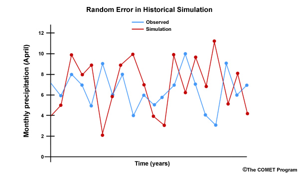
Errors occur in ESMs as is the case with most models. Some errors are random and difficult to adjust for. In this time series there is no clear relationship between the observed and the projected monthly precipitation.
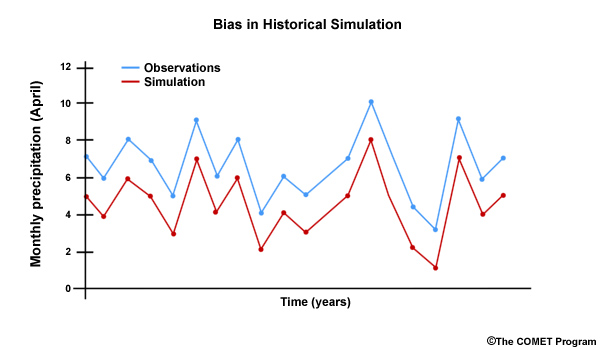
Other errors have consistency in their patterns or recurrence. For example, the climate model may consistently simulate too little precipitation. In this time series we can see that the projected April monthly values are always too low when compared to the observed values. In this case we have a dry bias. A bias is more easily removed than random errors. Removing bias helps us improve confidence in climate projections.
Bias Correction: Historical Period
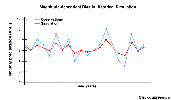
In reality, model bias isn’t typically corrected by one constant adjustment factor. For example, model bias may be magnitude dependent. In this time series comparing observed April monthly precipitation and ESM-simulated April values for a 20-year historical period, we see that the sign of simulation errors for the dry years is different than the sign of simulation errors for the wet years. There is still a consistent, systematic error, but the sign and magnitude of the error depends on the precipitation value. In this case, the simulated dry values are too wet and the simulated wet values are too dry.
So we need to quantify the bias correction across a range of values. To do this we compare observed values to the simulated values for the historical period. For precipitation, the bias correction will be multiplicative based on the ratio of observed to simulated values. The bias correction, when applied, should result in adjusted simulated values that equal the observations. In this case, we will make the dry simulated values wetter and the wet values drier.
Let’s see how that works by first ranking the 20 simulated values in the time series from lowest to highest. We will focus on the lowest, middle and highest value in this example. The lowest simulated value—rank number 1—is 5. The corresponding observed value is 3.
The bias correction factor would be 0.6 for the simulated value for rank number 1.
Rank of simulated value |
Simulated historical value |
Corresponding observed value |
Bias correction (observed / simulated) |
|---|---|---|---|
1 |
5 |
3 |
0.6 |
2 |
5.5 |
4 |
0.73 |
3 |
5.5 |
4 |
0.73 |
4 |
6 |
5 |
0.83 |
5 |
6 |
5 |
0.83 |
6 |
6 |
6 |
1 |
7 |
6 |
6 |
1 |
8 |
6 |
6 |
1 |
9 |
6 |
6 |
1 |
10 |
6 |
6 |
1 |
11 |
6.5 |
7 |
1.08 |
12 |
6.5 |
7 |
1.08 |
13 |
6.5 |
7 |
1.08 |
14 |
6.5 |
7 |
1.08 |
15 |
6.5 |
7 |
1.08 |
16 |
7 |
8 |
1.14 |
17 |
7 |
8 |
1.14 |
18 |
7.5 |
9 |
1.2 |
19 |
7.5 |
9 |
1.2 |
20 |
8 |
10 |
1.25 |
The bias correction factor is the observed over the simulated value, in this case 3 over 5, or 0.60. When the simulated value of 5 is multiplied by 0.60, we get the observed value of 3.
Likewise, a simulated value in the middle of the observed ranking—rank #10— is 6. The observed value is also 6. So the bias correction is 6/6, or 1.00. Thus, there is no correction needed.
The highest simulated value is 8—rank #20— and the corresponding observed value is 10. The resulting bias correction is 10/8, or 1.25.
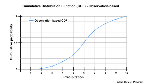
To help visualize a distribution of values we develop a Cumulative Distribution Function, or CDF, from the time series data.
You can learn more about what CDFs are in the COMET module: Introduction to Verification of Hydrologic Forecasts, section 2.`
This CDF shows the probability of non-exceedance, expressed as cumulative probability on the Y axis, versus the April monthly precipitation amount on the X axis. Let’s look at an example of how this is read. For a cumulative probability of 0.80, the monthly precipitation is 7.5. Since the CDF is based on non-exceedance probability, this means that there is an 80 percent chance that the value of 7.5 won’t be exceeded. In other words, there is an 80% chance that precipitation will be less than or equal to 7.5. Thus, 7.5 is in the top 20 percent of values.
The monthly precipitation value of 4.5 would be associated with a cumulative probability of 0.20.
This means that there is only a 20% chance that 4.5 won’t be exceeded. Thus 4.5 is in the lower 20% of the distribution of monthly values.
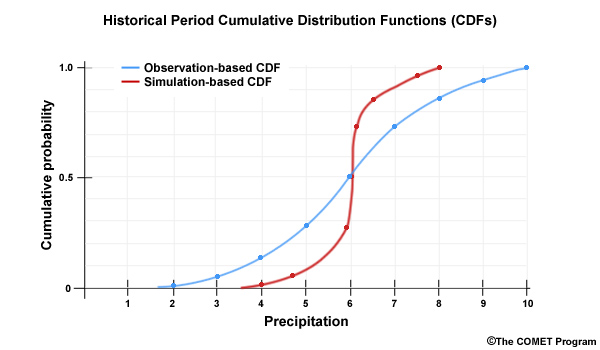
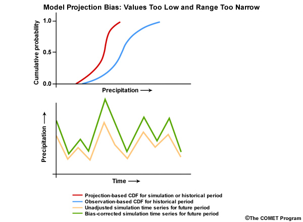
The red CDF represents values in a historical simulation. So the blue is the observation-based CDF and the red CDF is simulation-based. It is important to note that the space between the two CDFs provides a visual depiction of the bias for each probability. Value-specific bias correction factors are used to remove the bias. For example, if the model simulates a value of 7.5, we see from the simulation-based CDF that a simulated value of 7.5 has a cumulative probability of about 0.95. At that same cumulative probability, we see the observation-based CDF gives us a value of about 9. Thus, all simulated values of 7.5, including future values, will be bias corrected so that they will equal 9.
When the bias correction is applied, the CDF based on simulated values will take on the shape of the observation-based CDF.
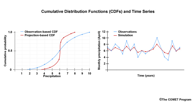
When we look at these two CDF plots together we see that the simulation based CDF covers a much smaller range of values along the X axis. The bias correction will expand the simulated spread to match the observed spread.
This is consistent with the time series view that shows a more compressed spread for the simulation of the historical period. High values from the simulation have a dry bias and low values have a wet bias. The bias correction will adjust the simulation to match the observation time series.
The amount of adjustment needed to match the simulation based CDF to the observation-based CDF provides us with a bias correction factor for each probability.
Bias Correction: Future Projections
Bias-correction of future projections:
Assume same model bias for future simulations as for historical
Remove model bias in future projections without changing future trends
For future simulations, we will assume that the model has the same bias as for the historical period, and will therefore use the same bias correction factors derived for the historical simulations. The goal is to remove model bias without changing the trends in the future simulations.
There are four types of bias corrections for simulated data:
Overall shift to higher values
Overall shift to lower values
Expand the range of values so that higher values get higher and lower values get lower
Compress the range of values so that higher values get lower and lower values get higher
In the example we have been considering, the bias correction is expanding the range of values.
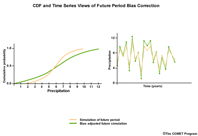
Now what if the same model projection for a future simulation has a CDF that looks like this? We assume it is simulating a range of values that is too compressed, just as it did in the historical period.
We apply the bias correction factors derived from the historical period and we get a bias-corrected future simulation that shows an expanded range of values.
In the corresponding bias adjusted future time series, the values have a larger range with even higher high values and lower low values.
There are a variety of biases that can show up in model projections. For example, a historical simulation—the red CDF—may show that the model simulation is both too dry and it doesn’t contain enough spread in values as the observations—the blue CDF. Computed bias correction factors in this case will increase all values and expand the range in the historical simulation. When the same bias correction is applied to future simulations we see in the time series that all values are increased, and the range is expanded with the high values increasing more than the low values.
Although there are different implementations, the widely accepted method for bias correction, as illustrated here, typically involves removing systematic error, based on performance of a model projection during an observed historical period.
Important assumptions we make when using bias-corrected climate projection data include:
There are no random errors in the climate projection data.
In many cases the projection data will contain both systematic error (bias) and random error
The most appropriate emissions scenario was chosen for the projection data.
The model projection data will only be as good as the model and its input data, such as the emissions scenarios.
There is stationarity in the physical processes affecting climate (the most important of the three)
The assumption is that the current influences on climate variability represented by the historical observations will not change–that is, the influences will remain stationary in the future.
There are limitations to assuming that the historical base period biases will be the same as the biases in the future projections.
Spatial Downscaling
In addition to bias correction, spatial downscaling is often done to make climate simulations more regionally relevant. Downscaling allows aspects of climate change to be presented on a spatial scale that is useful for analyzing and simulating climate impacts. Regions where local manifestations of climate patterns result from complex topography or coastal interfaces may find downscaling a necessity.
Statistical versus Dynamic Downscaling
Downscaling: Two classifications of methodologies
Statistical
Advantages
Statistically relates coarse resolution data to high resolution observed climate
Computationally efficient, easier to generate scenario ensembles
Limitations
Assumes stationarity in relationship between predictor and predictand
Dynamical
Advantages
High resolution Regional Climate Model (RCM) to simulate regional climate
Doesn’t depend on historical observations
Ideally accounts for complex, non-stationary relationship between predictor and predictand
Limitations
More computationally intensive
Affected by errors in underlying ESM that provides boundary conditions
Different RCMs give different results
There are many spatial downscaling methods, but they can generally be classified into two categories: 1) statistical, and 2) dynamical.
Statistical methods start with the coarse resolution ESM information and statistically relate those data to the observed local climate of the region. Statistical methods are more computationally efficient. This makes it easier to generate an ensemble of projections for a given climate change scenario. Statistical downscaling methods assume a certain stationarity to the climate. For example, the relationship between elevation, the predictor, and the resultant snowpack distribution, the predictand, will be the same in the future as in the past.
Dynamical methods embed a high resolution Regional Climate Model (RCM) within an ESM to simulate climate processes at spatial scales finer than that of the driving ESM.
This provides the ability to better capture the effects of terrain on precipitation and temperature over the region of interest. Dynamical methods are not as bounded by the historical observations and theoretically can represent non-stationarities in the relationship between the predictors (temperature,precipitation, elevation) and the predictand (snowpack). But they require more computer resources and they still feature their own simulation biases much like the ESMs feeding them input information.
Spatial Downscaling: Statistical
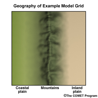
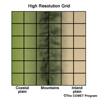
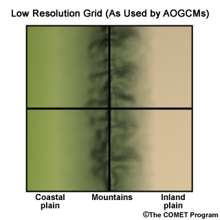
Consider this hypothetical situation where we have a coastal plain, a mountain range, and an inland plain. The geographic location is similar to the U.S. state of Oregon, so the coastal plain is wetter than the inland plain and the coastal side of the mountains is wetter than the inland side.
In a high-resolution representation, we have a 6 X 6 grid.
A 2 X 2 grid represents the coarser ESM resolution.
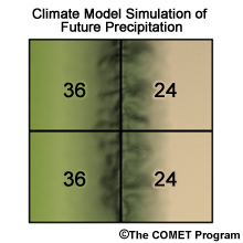
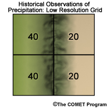
This 2 X 2 figure shows a bias-corrected 30-year mean monthly precipitation simulation, in mm, for a specific month. How do we downscale this information to account for orographic effects?
The first step is to get an observation-based monthly climatology with high spatial resolution for that same month.
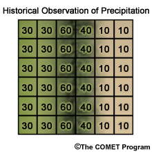
Here is the 6 X 6 grid of observation-based monthly climatology values over the historical period for the same month as the future simulation.
In the next step we need to develop a common spatial resolution for comparison of the future simulation with the historical climatology. This step may seem counter-intuitive because we will take the high resolution 6X6 observation grid and interpolate the values to a 2 X 2 grid. So, for example, the 9 grid boxes in the upper left quadrant will be summed and divided by 9 to get a value of 40. The result, shown here on the right, is a rather smoothed out, observed precipitation climatology. Again, this is done so we can make comparisons with the future period simulations that are produced on this scale. Later, we will bring back the high-resolution climatology for the final downscaling step.
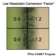
e.g. For top-left quadrant: 36 ÷ 40 = 0.9
The next step is to quantify the relationship between the simulated and observed data on the coarse 2 X 2 grid. This is done by taking the ratio of the future simulated values over the observation-based climatology to get a conversion factor. The conversion factor shows that the observation-based climatology for the two grid boxes on the left needs to be lowered to match the simulations values. The observation-based climatology for the two grid boxes on the right needs to be increased to match the simulation values.
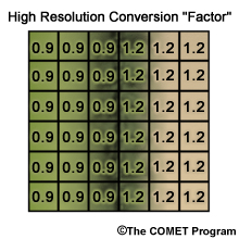
Next we want to map those conversion factors from the coarse grid to the high resolution 6 X 6 grid.
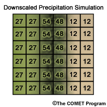
In the final step, high-resolution observed precipitation climatology is brought back. It is multiplied by the high resolution conversion factor to get the high resolution simulated precipitation. So what exactly was done in this last step? The conversion factor represents the relationship between the observed and simulated datasets. It therefore tells us how the observation-based grid needs to be adjusted to represent a simulation with high spatial resolution. The observation-based climatology grid provides the spatial detail that was lacking in the simulated data.
We developed this example with exactly the same area-averaged precipitation for both the observed and projected precipitation so that you can see how the final projection grid compares with the initial observed grid. As you can see, the spatial downscaling method illustrated here did capture the orographic impacts seen in the observations. But it doesn’t seem to do it perfectly because this approach only approximates the orographic effect. Even with its limitations, downscaling allows us to account for local controls on climate.In the western United States, for example, this includes the important influence of elevation and elevation gradient on both the distribution of precipitation and whether it is rain or snow.
Bias Correction and Spatial Downscaling (BCSD) Method - REAL DATA
BCSD: Bias Correction and Spatial Downscaling methodology (Wood et al. 2002)
Applied to projections produced by the ESMs in IPCC Assessment Reports
Although there are reasons for selecting one bias correction and/or spatial downscaling methodology over another, for this case study we have chosen to demonstrate a common methodology used in water resources studies by the Bureau of Reclamation and many other entities.
The Bias-Correction and Spatial Downscaling methodology, or BCSD, has been applied to climate projections produced by the AR models.
BCSD methodology:
Uses AR data from a variety of spatial resolutions
AR data re-gridded to common spatial resolution
Statistically downscales the common resolution to a higher spatial resolution
The ESM data from the Assessment Reports are at a variety of spatial resolutions. In BCSD the data are re-gridded to a common spatial resolution. After bias correction, the data are downscaled using a statistical downscaling approach, resulting in a higher spatial resolution.
BCSD, Part 1: Bias Correction
BCSD bias correction (here using older AR4 data, but AR6 data could use the same approach)
Define a historical period: 1950–1999
Run climate projections for historical period and identify simulation bias
Correct for model simulation bias in historical period
Apply same bias correction to future climate simulations
Assumption: Biases in the future will be similar to that in the historical base period
First, we will define our historical period as 1950–1999. We will then run ESM simulations for the 1950–1999 historical period and determine the sign and magnitude of bias associated with each simulation. Next we’ll correct for the bias in the historical period by computing bias adjustment factors. Finally, we’ll apply this same bias adjustment to future period simulations.
Recall, an important assumption is that biases identified in the historical period will represent those in future projected periods.
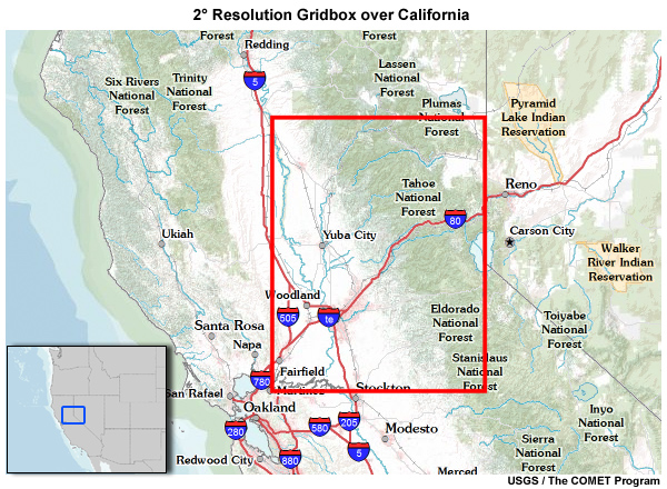
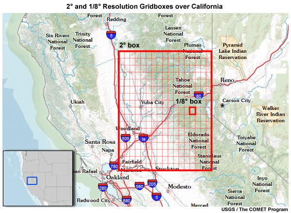
Let’s use ESM model projection data for December monthly precipitation in a 2° X 2° gridbox in the central part of the U.S. state of California.
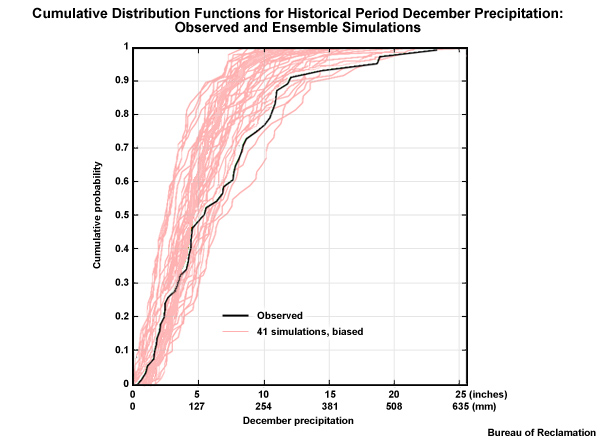
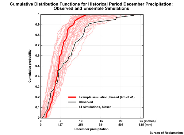
Here we see the ESM historical simulations (the light red lines) from a coarse 2° spatial grid presented in a cumulative distribution function plot with cumulative probability on the Y axis and December precipitation totals on the X axis. The high-resolution observation-based climatology—the black line CDF—was remapped to the coarse 2° spatial grid so that it will be more directly comparable to the ESM data. Each light red line CDF represents a simulation for the 50 Decembers in the 1950–1999 historical period.
There are 41 unique historical simulations, representing the 16 AR4 models and the varying inputs to those models. Differences in inputs are associated with initial conditions, and some differences in estimated historical climate forcing that drove these simulations. There are actually 112 simulations, but there are many duplicates in the historical base period, so there are only 41 that are unique. These 41 unique historical simulations will be used to generate 112 unique future simulations that include the effects of the three emissions scenarios that are used in the future period.
Interpret CDF 1
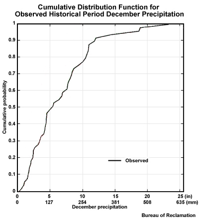
If we look at the CDF for just the observations, we see this distribution of values for 50 Decembers.
Looking at this CDF, imagine a corresponding times series of observed December precipitation for 1950–1999.
What would be the value of the highest peak? The highest peak is about 23 inches, (˜580 mm).
What would be the lowest value? That is the X axis value where the non-exceedance probability is 1.0, meaning that there are no values that are greater. The lowest, corresponding to a non-exceedance probability of zero, is < 1 inch (< 25 mm) precipitation.
What would be the median value? The median, corresponding to a non-exceedance probability of 0.50 is ˜5-6 inches, or ˜125-150 mm.
Interpret CDF 2
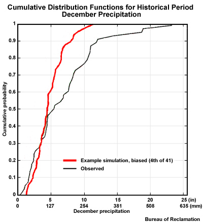
The red trace shows the CDF of climate model projection #4, one of the 41 unique simulations. It simulates December monthly precipitation by one model projection for the 50 Decembers in the historical period.
Recall the earlier section on deriving bias adjustments. Compare these two CDFs. The following bias or biases are indicated with the Projection #4 for the historical period:
The simulated range of values is too narrow.
There is a wet bias for low values.
There is a dry bias for high values.
There is a magnitude dependent bias.
General Bias: All Simulations
The range of values associated with the projection is more narrow than the range associated with the observations. There is mainly a dry bias, although we can see a small wet bias for the low values. Furthermore, the magnitude of the dry bias appears to increase as the precipitation values increase.
In this graphic, once again we see the CDF plots in bold red and black for the projection #4 and the observations. Again, the light red lines represent CDFs associated with 40 other unique simulations, giving a total of 41 for the historical period. Now we will compare the observed distribution with the distribution of December monthly precipitation values for an ensemble of model simulations.
Although there are a variety of simulations, most individual members of the ensemble show a similar bias tendency to the one we just looked at, Projection #4. The bias corrections for most of these simulations will likely expand the range of values. In addition, most model projections will have a dry bias corrected for the upper portions of the data distribution. Some of these adjustments will be very significant as seen by the large area between the observed CDF and many of the simulation-based CDFs.
For the lower values in the lower part of the distribution, small adjustments for either wet or dry bias will be needed on future simulations, depending on the projection.
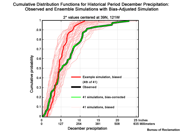
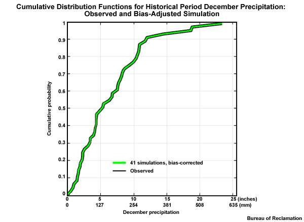
The bias correction is determined and applied for each probability and each projection for the historical period. Once the bias correction is applied,
Each projection-based CDF will equal the observation-based CDF and they will line up on top of each other. This is represented by a green line CDF.
In the future, each of the 112 simulations will use the same set of distribution-based bias corrections that were used in the historical period.
Bias Correction of Values Outside Historical Range
The bias correction approach that we just illustrated is appropriate for data that does not have a distinct trend in the future median values.
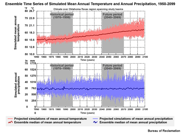
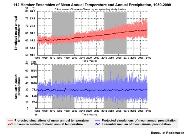
In this time series from Oklahoma and Texas, we see an ensemble of 112 simulations for mean annual temperature and precipitation from 1950–2099. The precipitation simulations here provide an example of data with no distinct trend. The median value of mean annual precipitation from 112 simulations is depicted by the dark blue line. From 1950 through 2099, it was very close to 30 inches (760 mm). However, for temperature there is a distinct trend toward warmer as seen by the dark red line. With this trend it is possible that future values will lie outside the range of historical values. This limits the ability to determine bias correction factors based on historical values.
Bias correction when data shows a trend with time
Distinguish between errors and trends
Remove trend temporarily to adjust for bias
If there is a trend, we must distinguish this from the model errors, including bias. To do this we remove the trend so that we can focus on residual variations and then adjust those variations for model bias.
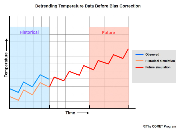
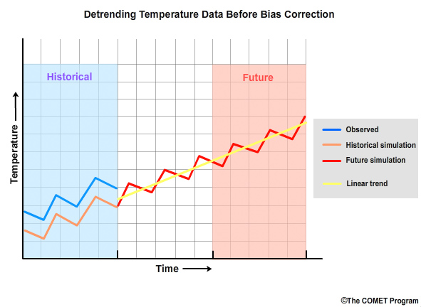
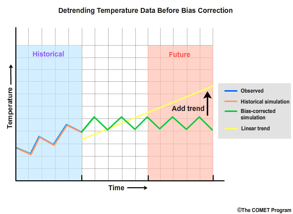
In this hypothetical case, we see a temperature simulation that extends from the historical period, in orange, through the future period, in red. The observations, in blue, indicate that the historical simulation has a cool bias. Before bias correction is applied to future periods, it is desirable to have values of similar magnitude in both the simulated historical and simulated future periods. To achieve this we need to remove the trend in the data, called detrending.
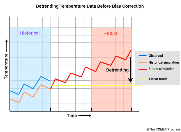
We start by quantifying the linear temperature trend in the simulation and then removing it.
This detrending is done before bias correction.
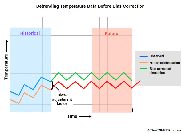
The bias correction is then done on the detrended values.
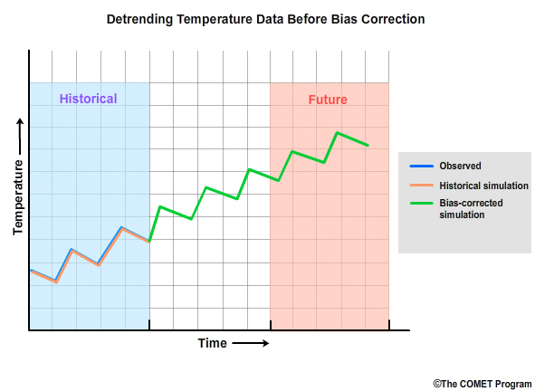
Once the bias correction is complete, the linear trend is added back.
The final result is a time series into the future that has been corrected for bias and still contains the trends from the model projections.
Data trends are not the only reason that future values may lie outside the range of historical observations. In the precipitation time series, note that there are individual simulations that are anomalously high and low. These may lie outside of the historical range. If so, an assumption must be made such as, the high value will use the same bias correction used for the highest simulated historical value. Likewise, the low value would receive the same bias correction associated with the lowest simulated historical value.
BCSD, Part 2: Spatial Downscaling - Real Data
BCSD Downscaling:`
Downscale global projections to 1/8° grid from 2° grid
Using 1/8° observed climatology from historical period
This step will use the bias-corrected coarse 2° x 2° data and downscale it to the targeted 1/8° x 1/8° resolution using 1/8° x 1/8° observed climatology from our historical period of 1950–1999.
Let’s review the basic statistical downscaling procedure that was illustrated in the exercise shown earlier in this case study, but this time with real BCSD data.
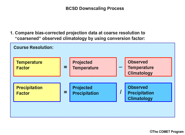
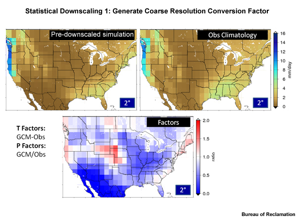
First we determine how the coarse bias-corrected projection data differ from observed climatology “coarsened” to that same 2° spatial resolution.
We do this by computing a conversion “factor”. The “factor” will be:
Incremental for temperature: that is, the temperature factor equals the coarse resolution temperature simulation minus the coarse resolution observed temperature climatology
Multiplicative for precipitation: that is, the precipitation “factor” equals the ratio of the coarse resolution precipitation simulation to the coarse resolution observed precipitation climatology.
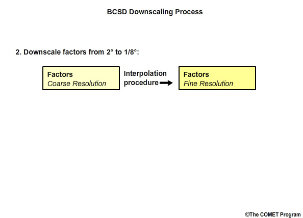
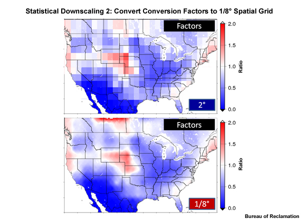
Next we downscale the “factor” values from the 2° grid to the 1/8° spatial grid using an interpolation technique.
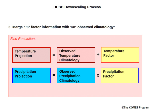
Finally we merge the 1/8° “factor” information with the 1/8° observation-based climatology to compute the high spatial resolution projection data so that:
High resolution temperature simulation equals the observed high resolution temperature climatology plus the high resolution temperature factor, and
High resolution precipitation simulation equals the observed high resolution precipitation climatology times the high resolution precipitation factor.
Let’s look at an example of how this method is applied with mean monthly precipitation rate, expressed in units of mm/day.
Here is the 2° spatial grid of observation-based climatology, and here is the 2° historical simulation, both for 1950–1999. Since we are dealing with precipitation, the factor will be computed as the ratio of the historical simulation over the observed climatology. This is done for the entire spatial domain for each time step. So in this case it is done for each month for each of the 50 years in the observed period and each projection run.
The result is a conversion factor map on a 2° grid. These factors represent a ratio and are equivalent to deviations from climatological normal conditions that are regularly reported by the National Climatic Data Center. A factor value of 1.0 would indicate no climatological deviation between the observed and simulated data. Factor values greater than 1.0, in red shadings, correspond to regions where simulation values are greater than observed climatological reference values. Blue shading indicates areas with factor values less than 1.0, showing regions where simulated values are less than the observed climatological reference.
SYMAP method: Shepard, D.S. (1984) Computer mapping: The SYMAP interpolation algorithm, in Spatial Statistics and Models, edited by G.L. Gaile and C.J. Willmott, pp. 133 145, D. Reidel, Norwell, Mass.).
The factor values are next downscaled to a spatial resolution of 1/8° using an inverse distance squared method, in this case, the SYMAP method.
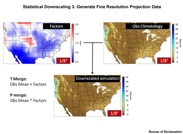
Next we bring back the high-resolution, 1/8°, observed climatology data and multiply these by the high-resolution factor values. The result is a 1/8° degree resolution of the projection data.
We have now spatially downscaled the simulated data so that the simulation means are retained and the observed variances are preserved.
Summary of BCSD:
Data reproduced to make it more representative of local climate forcings
Bias correction to remove systematic error
Downscaling to obtain finer spatial resolution
Let’s take a moment to summarize what we have done to this point. We have taken the coarse resolution ESM data and made it more representative of local climate forcings through bias correction and downscaling. Next we will discuss why ensemble information may be beneficial.
Using Climate Projection Ensembles
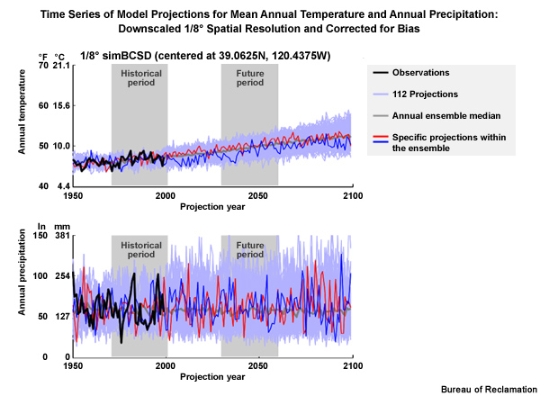
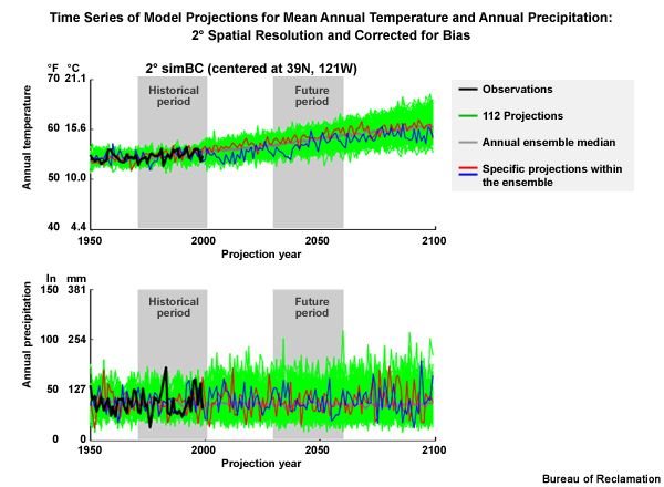
In many cases we will be using an ensemble of climate projections to describe possible future conditions. Let’s go back to the California location and examine two time series of bias corrected and downscaled data:
1) a temperature ensemble, and 2) a precipitation ensemble. The light blue represents the ensemble of 112 climate simulations from 1950–2099. The gray line is the ensemble median of the annual means. The dark blue and red are simulations from individual model projections within the ensemble of projections. The black line shows observed annual means through 1999.
In this time-series view we can see sequencing characteristics, particularly in the individual simulations. These sequencing characteristics are the year to year variations in temperature or precipitation.
In an ensemble of climate model projections, each projection simulates a unique sequence of values. We can see this in the maxima and minima seen in the red and dark blue traces. A single projection has both a general trend and variability around that trend. So it may simulate a sequence that describes a major spell, such as a multi-year drought. The problem is that a sequence from any one projection is not considered to be more likely than that of another projection, nor expected to be the exact sequence that plays out in the future.
Climate projections:
Capture trends
Useful for statistical representations
Not useful for detailed sequencing
The strength of climate projections is to capture trends. Climate modelers have confidence that climate projections are useful for developing statistical representations such as: in a future 30-year period the mean annual precipitation is likely to be 1000 mm. There is little or no confidence that a 30-year simulation can put the dry and wet years in the correct sequence. The goal of the projections is to represent the trends in the means and variability, but not the specific year-to-year sequencing.
An ensemble of projections is better at smoothing out the short term variability and helping us focus more on the trends. In this time series, we can see that temperature has a general upward trend with time, but precipitation doesn’t. Both variables show a greater trend for increased variability with time.
There are several methods for re-introducing sequencing into the future periods. One way is to use the past as guidance as we will demonstrate in a later example.
BCSD Example: Using Ensembles
We have discussed three important steps in using BCSD to prepare model projections for future periods:
Bias correction of simulations
Statistical downscaling of the simulation data to obtain more regionally representative information
Use of an ensemble of projections for more confidence in simulated trends
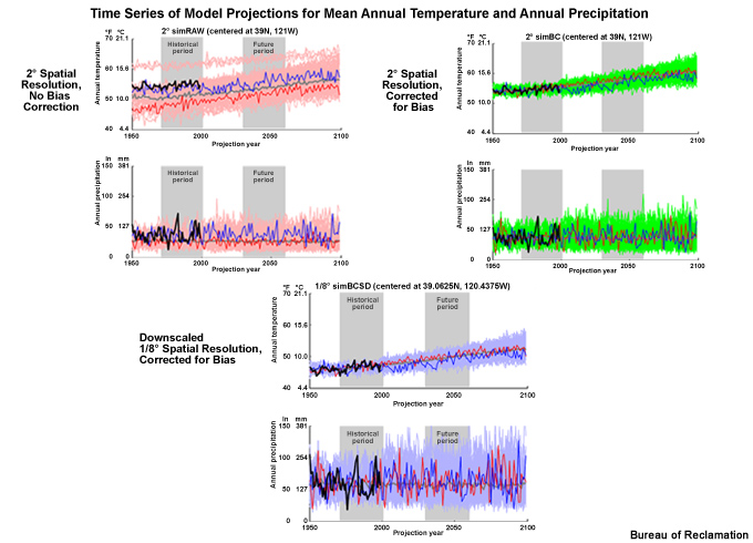
With that in mind, we will now analyze and compare three projection ensembles that show these steps in BCSD.
Each of these three time series show examples of an ensemble of temperature projections and an ensemble of precipitation projections including two periods of interest: a historical period of 1970–1999 and a future period of 2030–2059.
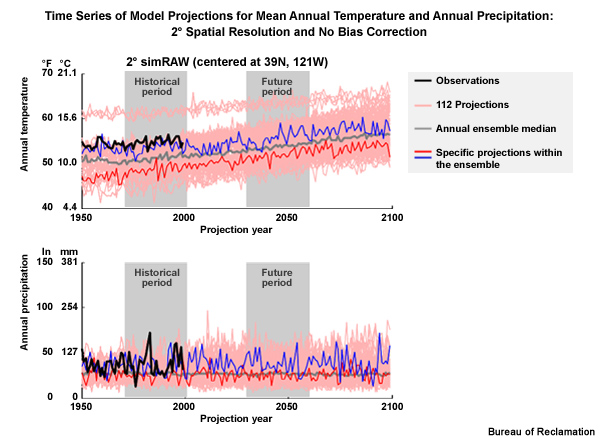
The first of these three time series shows the data before bias correction and spatial downscaling and therefore at the raw 2° spatial resolution.
The black line shows the observed data through 1999. The blue and red lines show simulations from specific projections within the ensemble. The gray line is the ensemble median of the annual means.
The light red lines show the full set of ensemble traces.
The next one shows the data after bias correction but still at the coarse 2° spatial resolution.
And the last one, which we have already seen, shows the data after both bias correction and downscaling to the 1/8° spatial resolution.
The light blue lines in this case show the full set of ensemble traces.
STEP 3. Determine climate change scenarios and select associated climate projections
In STEP 3 we will characterize trends and variability of the future climate. With these data we will:
Define climate change scenarios described by future temperature and precipitation, and then
Identify specific climate model projections that will inform each climate change scenario
We will examine the future trends and variability as represented by all of the ESM projections taken together, to determine a set of climate change scenarios to work with.
Recall that a climate change scenario describes general characteristics of a future climate; for example, warmer and wetter, or warmer and drier. When we characterize future trends and variability, we will introduce two important terms:
The central tendency, which is based on the median value of the projections, and used to establish whether a general trend is depicted by the data, and
The spread, which is the variability around the general trend in the projection data.
Next, we will identify specific ESM projections out of the full set of 112 (of AR4), to inform each climate change scenario. For example, we may determine that projection X, which is defined by a given combination of climate model and emissions scenario, will provide the information for our warmer and drier climate change scenario. Projection Y, defined by a different combination of climate model and emissions scenario, may be the best choice for informing a warmer and wetter climate change scenario.
Approaches for expressing future time periods:
Period change approach
Transient approach
The example we show will use the period change approach for expressing conditions in future time periods. We will contrast this with an alternative approach, called the transient approach.
The outcome of this section will be a set of climate change scenarios and a determination of which climate projections will be used to inform these scenarios.
Central Tendency, Spread, and Simulation Mean
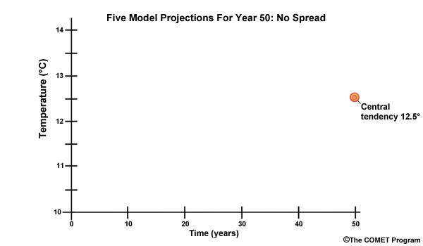
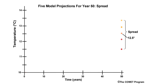
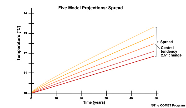
Let’s use a simple example to illustrate why it is useful to characterize the climate projections in terms of central tendency and spread. Imagine that we obtain five climate projections and all five indicate our area will have a mean annual temperature that is exactly 12.5°C in “year 50”. The central tendency of the temperature at “year 50” is 12.5°.
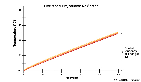
From our “central tendency” values we can derive a warming trend of “2.5° in 50 years”. Thus, the central tendency of the temperature change is 2.5°. Because there is no spread we would probably have high confidence in that projection.
Of course climate model projections don’t have such exact consensus. Let’s consider a more realistic example with five model projections in 50 years. In this case, the simulation spread shows a range from 11.5° to 13.5°. Right in the middle of the pack is 12.5°. But obviously we are less confident in that exact value this time due to the spread in values.
The 50-year trend continues to show that the central tendency of the change is 2.5° warmer. But again, we are less confident this time due to the spread in change values. Those change values are spread from 1.5° warmer to 3.5° warmer.
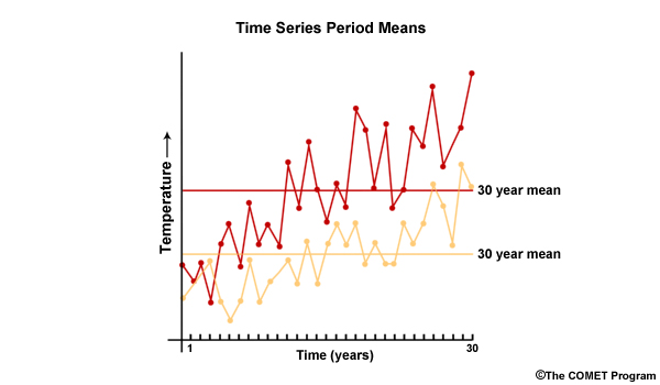
We will come back to central tendency and spread in a moment. But first let’s remember that the real data that we look at in the form of a time series will likely contain a large number of simulations, each with year-to-year variability. Here we have two time series plots of temperature simulations versus time for a 30-year period. The means of the two 30-year time series are shown by the horizontal lines. These simulation means will be the basis for quantifying how the variable changes from a historical period to a future period.
Define Period Change
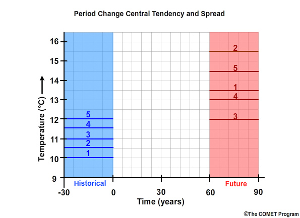
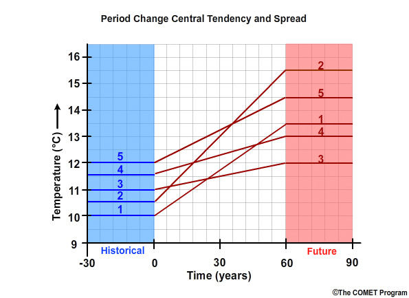
Now let’s say we have a total of 5 ESM projections to simulate the mean temperature for this 30-year historical base period. Here we see the simulation means for projection #1 through projection #5. Next, a set of future 30-year mean temperatures is simulated from the same 5 ESM projections. In many climate studies, the important questions are about central tendency and spread of the change between a historical period and a future period.
Change between historical and future periods is basis for period change method
The change between these two periods is the basis for what we will call the period change method. Let’s demonstrate the period change method with a simple example using five projections.
The simulated future mean temperatures are labeled for projections 1 through 5. Note, the projection that produced the warmest simulation in the historical base period, projection #5, is not the same projection that produces the warmest simulation in the future period.
To make this clear, let’s connect the projection-specific lines. Projection #1, the least warm in the historical period, is connected with projection #1, the middle value in the future period. We do this for projections 2, 3, 4, and 5, and get 5 period change lines. The slope of each line represents the sign and magnitude of the period change in temperature for that specific projection.
Exercise: Quantify Period Change
For each projection, 1 through 5, the sign, negative or positive, and magnitude of the period temperature change are as follows:
Period Change |
Projection Number Period Change (change in 30-year Mean Temperature) |
|---|---|
1 |
+3.5degC |
2 |
+5.0degC |
3 |
+1.0degC |
4 |
+1.5degC |
5 |
+2.5degC |
These values, then, are the computed period change for each projection, which shows the changes in mean temperature between the two periods for each of the 5 model projections. Note that all of the period change values are positive, showing a warmer future, but the magnitude varies.
Ordering the values by magnitude, as shown below, allows us to draw a few conclusions:
Projection Number |
Period Change (change in 30-year Mean Temperature) |
|---|---|
3 |
+1.0degC |
4 |
+1.5degC |
5 |
+2.5degC |
1 |
+3.5degC |
2 |
+5.0degC |
Projection #5 represents the central tendency for the period change in the 30-year mean temperature, with 2.5degC warmer associated with the change simulated by this projection.
Projection 2 produced the largest warming (+5.0degC) in the spread and projection 3 produced the smallest warming (+1.0degC) in mean temperature changes between historical and future periods.
This exercise showed how central tendency and spread are derived from projection data. When using real data, there are many more projections and sometimes the spread ranges from negative to positive change values.
Time Steps: Monthly vs. Annual
Now let’s take the concepts of central tendency and spread and apply those to the two sets of climate change data that were introduced earlier in this case study. Those are the mean monthly temperature and precipitation, 1950–2099, from the Bias Correction and Spatial Downscaling (BCSD) method.
Two sets of climate change data:
Mean monthly temperature
Mean monthly precipitation
For 1950–2099
Bias corrected and spatially downscaled using BCSD
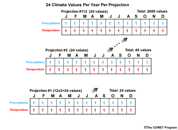
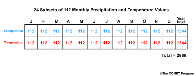
Each annual set contains 24 separate subsets of values, one for each month. And each subset will have 112 (for AR4) simulated values, one for each of the projections.
So there are actually 24 subsets of 112 monthly precipitation and temperature values that must be analyzed for determination of the central tendency and spread. This is a large number and we need to ask if there is a small, representative subset that we can use.
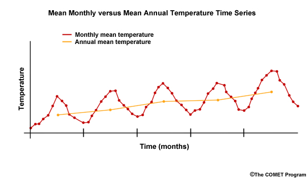
To answer that question, let’s take a moment to recall the general reason why we use monthly time steps. Consider monthly versus annual for mean precipitation and mean temperature. A monthly time step is typically more applicable for resolving seasonal cycles. A seasonal time step is sufficient for identifying trends in 30-year means between historical and future time periods.
Monthly time steps are more applicable for resolving seasonal cycles because those cycles are smoothed out in an annual time step. Monthly time steps typically show more variability than annual time steps.
Annual time steps, however, are likely to be sufficient and may be more reliable at detecting trends in means on the decadal time scale or longer. Therefore when considering the changes between two 30-year periods, the annual time step is commonly used for analyzing central tendency and spread of the period changes.
Annual time step:
Sufficient for detecting long-term trends
Commonly used in period change studies
Looking at the example we just completed, projection #5 was identified as the central tendency of the temperature for the period change using annual time steps. But we need monthly time steps to represent seasonal cycles. So, we will assume that the annual change is representative of monthly change, and that projection #5 represents each monthly central tendency as well.
Assumption:
Annual data is representative of monthly change
Projection #5 will represent central tendency of each monthly simulation
Going forward with real data examples, we will be representing central tendency and spread with mean annual temperature and mean annual precipitation derived from the BCSD data set.
Examine Climate Simulations: Oklahoma/Texas Case
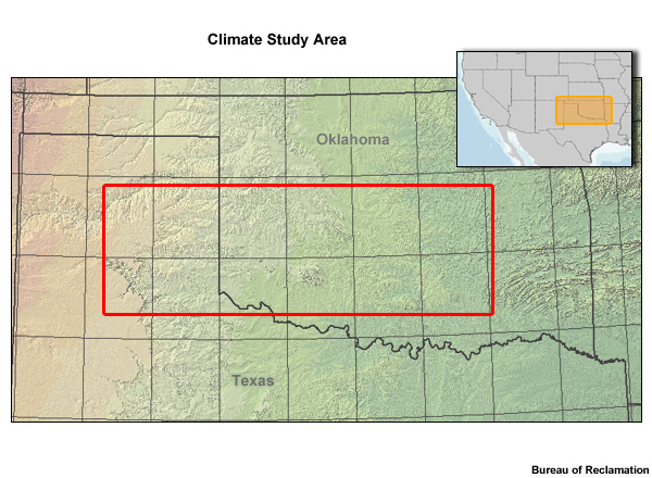
Let’s go to a climate study area in southwestern Oklahoma and part of the Texas panhandle. We will examine a time series of the bias-corrected and downscaled mean annual temperature projections from 1950–2099.
Temperature Time Series Trends
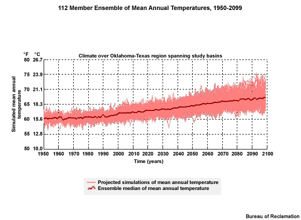
In this temperature times series, we see the annual means of the climate projections, and the spread of the projections for the period 1950–2099. The light red lines show the temperature traces for each of the 112 projections used. Recall, these projections are based on the 16 models used in AR4, with 3 emissions scenarios and a varying number of initial conditions for the individual projection runs. The bold red line shows the ensemble median of the 112 projections. Even in the ensemble median you can see year to year variability.
The general tendency in the temperature with time shows the following:
The ensemble median line shows a trend to warmer temperatures in the future.
There is an increase in the range of possibilities, or spread, with time.
Precipitation Time Series Trends
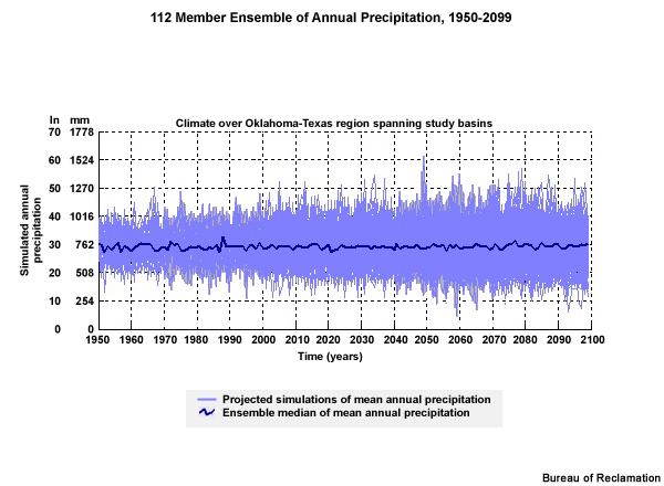
Here are the projections of bias-corrected, downscaled annual precipitation for this same area for 1950-2099.
The precipitation projection time series does not show a distinct trend toward either wetter or drier. It does show an increasing range of possibilities, or spread, with time. There is more spread in the precipitation projections than in the temperature projections.
Combined Time Series Trends
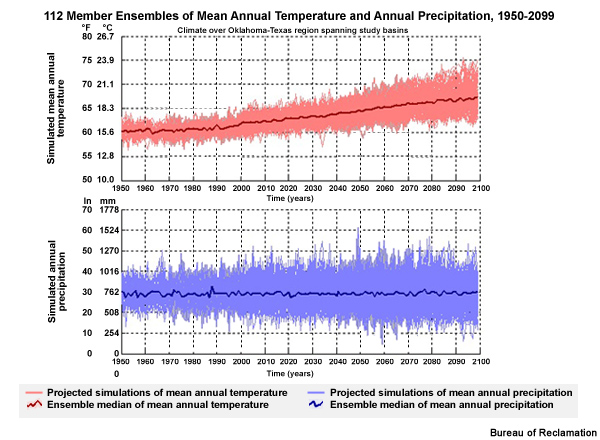
The time series plots for this location show a likely warmer future although exactly how much warmer grows more uncertain with time. Uncertainty in future annual precipitation is even greater than that for temperature with no well-defined trend toward either wetter or drier.
Evaluate Based on Period Change ~~~~~~~~~~~~~~~~~~~~~~~~~~~~~~~~~~~`
The time series plots of mean annual temperature and mean annual precipitation are good for a big picture view of the information in the climate projections. Next we will use the period change method, often used for impacts studies, to evaluate projected changes between a specified historical and a specified future period.
Period Change
Often used in impacts studies
Evaluate changes between specified historical and specified future periods
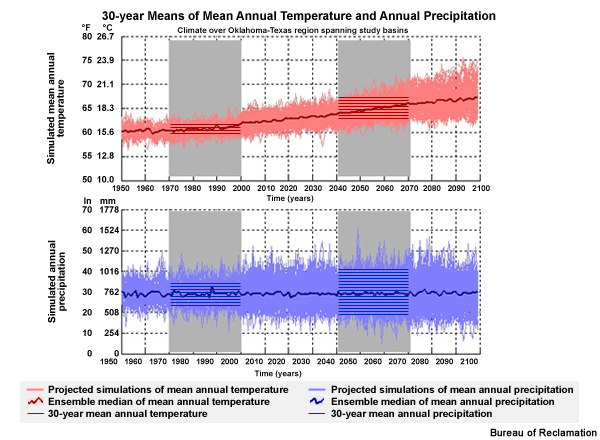
Here we see the two periods of analysis that will be used for our period change evaluation: the historical base period of 1970–1999 and the future period of 2040–2069.
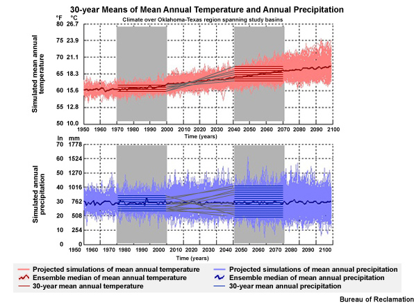
The horizontal red and blue lines represent the 30-year means for each simulation in each period. Note that not all of the projection means are shown. There are actually 41 unique simulations in the historical base period. These contribute to 112 unique simulations in the future.
Historical period: 41 unique simulation means
Future projections: 112 unique simulation means
112 unique change traces between historical and future periods
The result is 112 unique change traces between the historical and future periods.
Just as we learned in the illustration that we did earlier, the slopes of the lines between the historical period means and the future period means represent the magnitude and sign of the period change. It is these changes that are sorted and used to determine the central tendency and spread of the change between the two periods.
Slope of the lines: magnitude and sign of period change
Used to determine central tendency and spread of the change
Identify Climate Change Scenarios: California Case
We will now take a look at the BCSD simulation data from our California location to identify climate change scenarios from the full set of ESM projections we looked at in the previous section covering Step 2 of our process. We will select the central tendency and spread and use those to determine our climate change scenarios.
Identify Central Tendency and Spread ~~~~~~~~~~~~~~~~~~~~~~~~~~~~~~~~~~~~~~~`
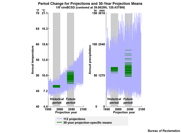
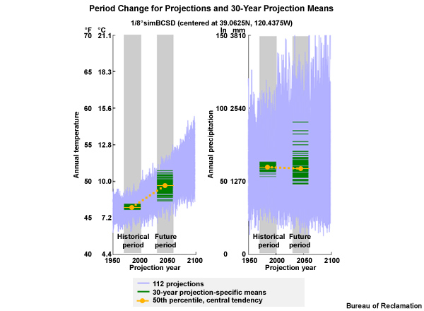
These time series are stretched a bit more in the vertical with the mean annual temperature versus time on the left and annual precipitation versus time on the right. The gray boxes denote the historical period, 1970–1999, and the future period, 2030–2059. The pale blue traces are the 112 simulations for temperature, left, and precipitation, right. You can see the large variation in the simulation values, especially for precipitation. The dark green horizontal lines are the 30-year means of the simulations; one mean for each simulation, for each variable. Even with the stretched vertical scale, many of the 112 simulation means are on top of each other. But you can see how the spread in the means increases from the historical period to the future period. You can also see that the warmest historical period mean is cooler than the coolest future projection mean.
The projection that represents the median change, or the 50th percentile, is shown in orange. This defines the central tendency for these data. As we would expect, the central tendency for the period change in mean annual temperature is positive, or warmer, by 1.7°C (3.0°F). The central tendency for annual precipitation is only 1% drier, confirming what we see visually, that there is little or no mean tendency toward drier or wetter with time.
Percent Change in Annual Precipitation shown by Ten Projections |
|
|---|---|
1 |
+30%* |
2 |
+10% (90th) |
3 |
5% |
4 |
1% |
5 |
-2% |
6 |
-2% |
7 |
-5% |
8 |
-10% |
9 |
-15% (10th) |
10 |
-35%* |
But for planning purposes we may be very interested in the possible outcomes that differ from the central tendency. Let’s use precipitation to define the spread more precisely. Here we have a sorted list of the % change shown by 10 projections of annual precipitation. The full spread ranges from the lowest value, -35%, to the highest value, +30%. Using the absolute maximum and minimum is not the only approach and often not even the preferred approach for defining spread. We may choose to eliminate some outliers by not using the full spread. In this example, we will eliminate the upper and lower 10% by using the values at the 10th and 90th percentile of the distribution to define the upper and lower limits of the spread. Now the spread ranges from -15% to +10%.
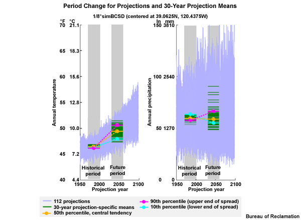
Let’s come back to our time series with the simulation means and central tendency. And, now let’s add the lower and upper limits of the spread as defined by the 10th and 90th percentiles. For temperature we see that the 90th percentile and the 10th percentile both show a trend toward higher temperatures in the future. As expected the 10th percentile line has a more gentle slope, showing the magnitude of warming is not as great. In fact the 10th percentile shows a period change warming of 0.9°C (1.7°F). This compares with a warming of 1.7°C (3.0°F) for the central tendency and 2.4°C (4.3°F) for the 90th percentile at the upper end of the spread.
For annual precipitation, the determination of the spread limits is not as easy to pick out from just the time series. Here we see the 10th percentile value showing a drying trend with about a 14% reduction of mean annual precipitation. The particular projection that produced that value was one of the wetter simulations for the historical period. The 90th percentile simulation comes from a projection that shows a wetter future. In fact, the 90th percentile value indicates a 15% increase in mean annual precipitation. This compares with the central tendency of a 1% decrease.
To deal with the uncertainty indicated by future simulations, we will develop more than one climate change scenario. A small set of climate change scenarios will permit planning for a range of possible outcomes.
Period Change: Central Tendency and Spread for Mean Annual Temperature and Precipitation
Mean Annual Temperature |
Mean Annual Precipitation |
|
|---|---|---|
Spread (Upper Limit) 90th percentile |
+2.4°C (+4.3°F): hotter |
+15%: wetter |
Central Tendency 50th percentile |
+1.7°C (+3.0°F) |
-1% |
Spread (Lower Limit) 10th percentile |
+0.9°C (+1.7°F): warmer |
-14%: drier |
From the period changes indicated by the climate projection data, an upper limit of spread, and a lower limit of spread for the temperature tendency separately from the precipitation tendency. But to develop meaningful climate change scenarios, we want to have a way to look at the central tendency and spread information from both variables at once.
We now have enough information to do this. So, next we will define our climate change scenarios using the central tendency and spread for both temperature and precipitation.
Because all of the temperature simulations showed a warming trend, we will call the lower and upper limits of the spread “warmer” and “hotter”. For the precipitation, the lower and upper limits of the spread will be called “drier” and “wetter”.
As a result we have five climate change scenario definitions:
Hotter and wetter,
Warmer and wetter,
Warmer and drier,
Hotter and drier, and
Central tendency which is warmer with similar precipitation.
Now that we have five climate change scenarios based on information from the full set of 112 projections, we will identify which specific projections will best represent the temperature and precipitation trends for each scenario. We will end up with a set of five projections that will represent, or inform, each of the five climate change scenarios.
Let’s take a moment to make sure it is clear where we are in the process. We just defined five possible climate change scenarios based on trends from the full set of 112 climate change projections. We chose more than one scenario to permit planning for a range of possible future outcomes. Now, we will select specific projections out of the 112 to inform each scenario.
Combine temperature and precipitation change information
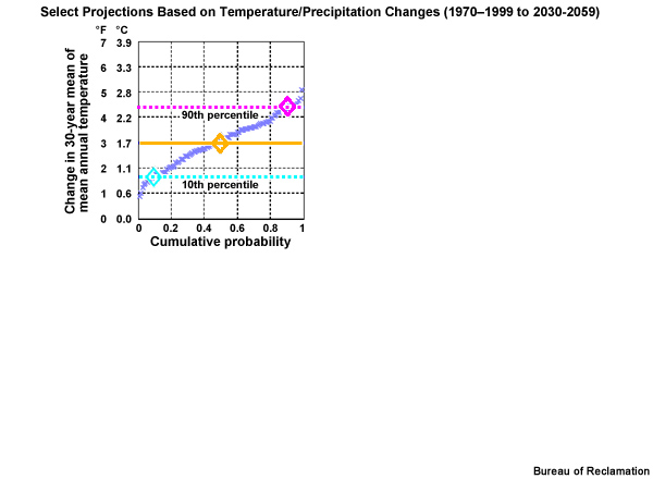
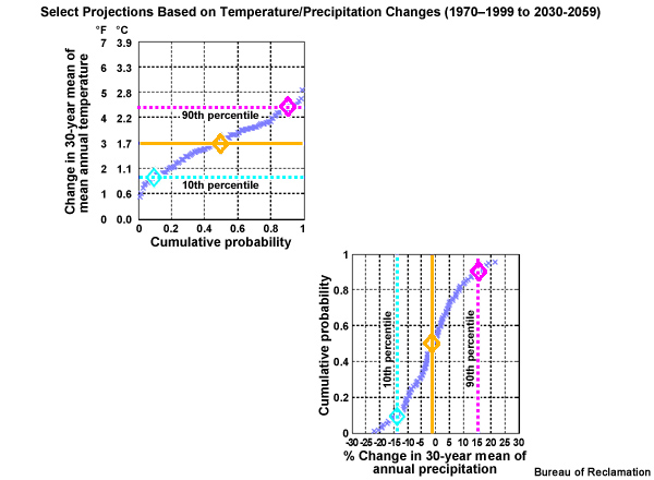
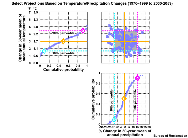
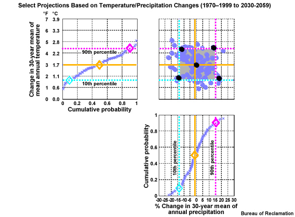
We will now construct a figure that allows us to combine the information about central tendency and spread from both the temperature and precipitation projections. Here is a cumulative distribution function of mean annual period change in temperature, based on the time series that we were just looking at from the California case. Note the cumulative probability values are plotted along the X axis. The diamonds show the previously identified change values; the lower spread limit, 0.9°C warmer, the central tendency, 1.7°C warmer, and the upper spread limit, 2.4°C warmer.
This corresponding CDF shows the period change in mean annual precipitation from the lower spread limit, -14%, to the central tendency, -1%, to the upper spread limit (+15%).
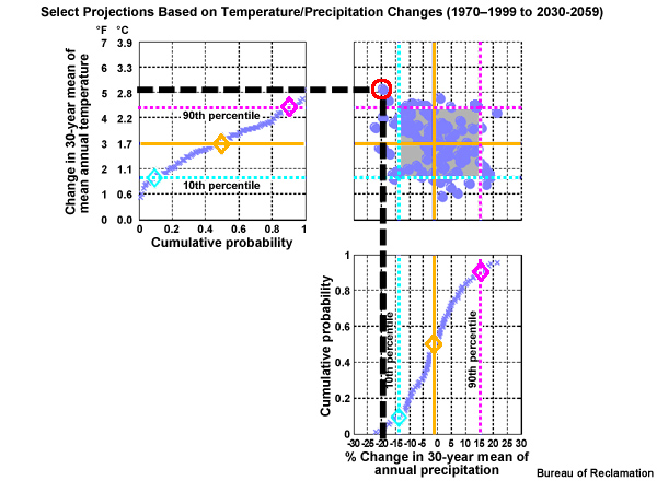
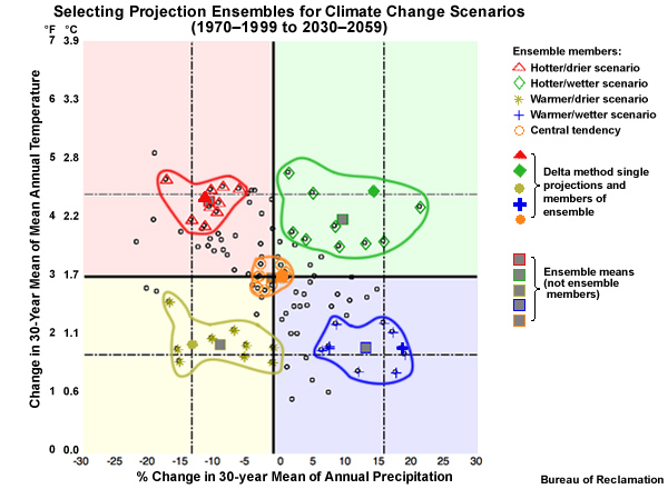
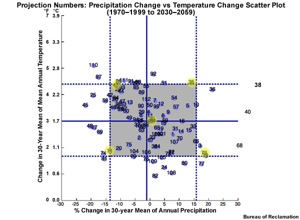
In the upper right is a scatter plot of the 112 projections. Each projection, represented by a dot, is plotted based on its period change in mean annual temperature and precipitation.
The red circle in the right panel of the figure above, for example, represents a projection that simulates a change from the historical base period to the future period that is 2.8°C (5°F) warmer and 20% drier.
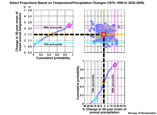
Now let’s extend the central tendency of the temperature change across from the left and the central tendency of the precipitation change up from below. Where these central tendency lines cross in the scatter plot denotes the temperature and precipitation values that should represent the central tendency climate change scenario.
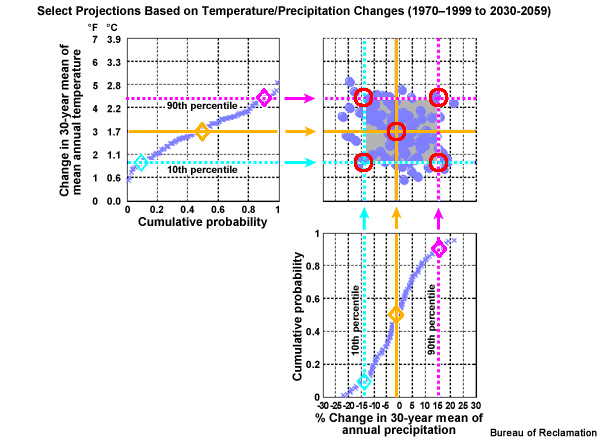
The 10th and 90th percentile lines that define the spread limits can now also be extended from the temperature and precipitation CDFs into the scatter plot. Four more cross hairs are created. These represent, clockwise from the upper right: hotter and wetter, warmer and wetter, warmer and drier, and hotter and drier. These, combined with our central tendency, are the five climate change scenarios defined by a location on the precipitation change versus temperature change scatter plot.
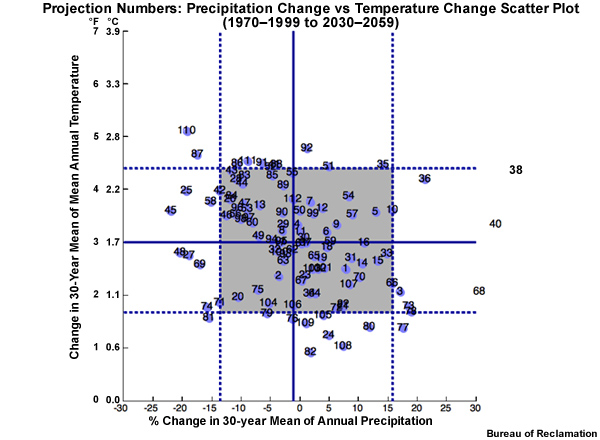
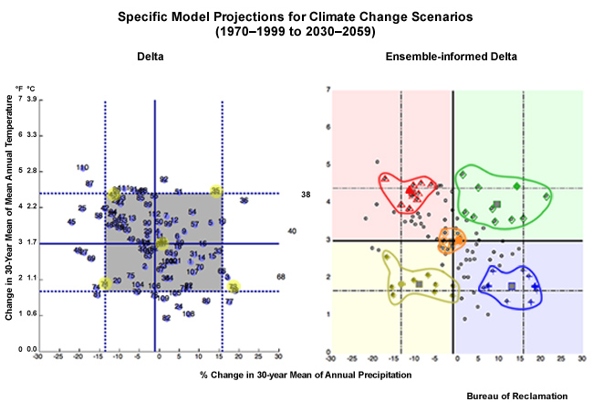
Each specific projection is represented by a dot on the scatter plot. We will identify the dot that is closest to the cross hairs that define the climate change scenarios. That ESM projection will be used to inform that particular climate change scenario. So the projection represented by this dot will be used to inform the climate change scenario for hotter and wetter. Which projection is it?
The individual projection run numbers on this plot are each associated with a specific combination of ESM, emissions scenario, and initial conditions. Projection #35 in the upper right is the one that will be used to define the hotter and wetter scenario.
Climate Projections that will Inform Climate Change Scenario
Climate Change Scenario |
Projection # |
ESM |
SRES |
|---|---|---|---|
Central tendency |
61 |
Max Planck Institute for Meteorology, Germany |
A1B (medium) |
Hotter/Wetter |
35 |
Institute for Numerical Mathematics, Russia |
A1B (medium) |
Warmer/Wetter |
73 |
Meteorological Research Institute, Japan |
A2 (high) |
Warmer/Drier |
71 |
Meteorological Research Institute, Japan |
A1B (medium) |
Hotter/Drier |
43 |
Center for Climate System Research, National Institute for Environmental Studies, and Frontier Research Center for Global Changes, Japan |
A1B (medium) |
Projection #35 comes from a Russian climate model using the middle emissions scenario A1B` [1]. These are the five projections that will be used to inform the five climate change scenarios. These five projections, and the five scenarios they represent, will define the range of possibility for planning purposes as we move from the historical base period to the future period defined earlier as 2030–2059. The specific model and emissions scenario for each projection are shown in the table.
It may strike you as odd that the two “hotter” scenarios come from projections that use the middle emissions scenario, A1B, and one of the “warmer” scenarios comes from a projection using the high emissions scenario, A2.
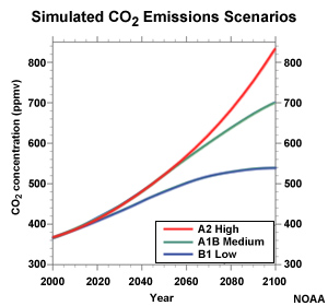
Recall that the A2 and A1B scenarios don’t diverge until after 2060. So for the period we are looking at, 2030–2059, it is not surprising that the difference between using A2 and A1B might not have much impact.
Using a single projection as input to each climate change scenario is not the only approach for informing climate change scenarios with ESM projections. It may be desirable to use an ensemble of projections, thereby minimizing the impact of internal variability in the model from one specific projection.
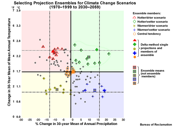
To do this, we start with the five single projections identified earlier for each climate change scenario. We use the same 10th, 50th, and 90th percentile thresholds for the change in the 30-year mean annual temperature and precipitation. But this time we use those five original projections, plus the 9 projections closest to each of the original projections.
The result is that we have identified 5 clusters of 10 projections, or 5 ensembles, to inform each climate change scenario. The ensemble of projections depicted with orange circles is the central tendency scenario: warmer with similar precipitation. The projection ensemble shown with red triangles informs the hotter and drier scenario; the projection ensemble with the green diamonds informs the hotter and wetter scenario; the projection ensemble with the blue crosses informs the warmer and wetter scenario; and the projection ensemble with the yellow stars informs the warmer and drier scenario.The squares represent the ensemble mean for each ensemble.
What are the advantages of using an ensemble of multiple projections rather than a single projection for each climate change scenario? Each individual projection contains uncertainty in its simulation. The uncertainty could make it more difficult to separate the climate trend signal from model-induced variability. An ensemble of projections helps make the climate trend signal easier to detect.
Advantages of using an ensemble of projections:
Uncertainty in individual projection may mask climate trend signal
Ensemble of projections may make climate trend signal easier to detect
Period Change vs. Transient Method
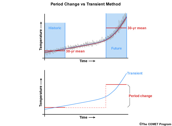
The “period change” approach shown in this section is not the only method for analyzing climate projections over time. Another method, known as the “transient method”, examines the continuous change with time. This method is beginning to gain popularity due to its ability to portray non-linear trends. Here we see a non-linear trend in the climate projection time series.
Transient method preserves non-linear trends
Period change method sufficient for many assessment questions
Using a period change approach will mask the non-linearity. In this case it hides the rate of increase in temperature in future periods.
The transient method preserves the non-linear trends and therefore may provide more useful information when changes in rates are important.
The choice of which method to use, period change or transient, should be based on the information you are trying to get from the study. There are advantages and disadvantages either way. Period change is sufficient for addressing many assessment questions. But if you need to know more about the transition of changes and account for non-linear changes, the transient method could be more appropriate.`
As ESMs become more sophisticated, they may reach a point where they can reasonably simulate trends affecting individual storm evolution as well as climate related cycles like ENSO. That would permit future simulations that are less dependent on the specific events in the historical base period. Transient representation of time using more sophisticated climate change simulations could even allow some estimate of event sequences in the future.
As ESMs become more sophisticated:
Future simulations should be less dependent on historical data
Transient representation of time may be more appropriate
Step 3 Summary / Next Steps
In our description of step 3 of our hydro-climate inputs for climate change preparation process using the BCSD method, we have examined the climate data from the full set of projections using a period change approach for a historical period and a future period. We developed five climate change scenarios for planning purposes, and selected the specific projections to inform (or represent) each of those scenarios. We have the choice of using either a single projection to inform each scenario, or an ensemble of projections. From this point forward, we will use both the single projection and ensemble-informed approaches.
Section 3 summary:
Period change approach used to examine full set of climate projection data
Five climate change scenarios developed
Specific projections selected to inform each scenario
Single projection per scenario
Ensemble of projections per scenario
Review:
The term “central tendency”, as defined in this module in the context of climate change projections, can be explained as being the median of the projected changes, and it can be used to determine the general trends.
The period change method differs from the transient method in that the period change method examines the change from one time period to another; and has been used more frequently in planning exercises.
A possible advantage of using an ensemble of projections rather than one single projection to represent a climate change scenario is that an ensemble expands the range of the possible changes; and helps us focus more on the dominant trend in the data.
The spread used to determine the range of possible outcomes can be the range from the 10th to 90th percentiles, 25th to 75th percentiles, absolute minimum to the absolute maximum, 5th and 95th percentiles; any of these can be correct. In our hypothetical example we used the absolute minimum to the absolute maximum. Then, in our actual BCSD data case from California, we used the 10th to 90th percentiles.
In addition to the central tendency, the additional four climate change scenarios that we are working with are: hotter/wetter, warmer/wetter, warmer/drier, hotter/drier.
In Step 4 we will develop the five climate change scenarios in more detail so that we will have specific conditions on monthly and daily time steps that represent the possible future conditions. These can be used for modeling impacts on surface hydrology and crop irrigation water.
STEP 4. Develop climate-adjusted weather for climate change scenarios
In STEP 4 we are now at the point where we will develop climate-adjusted weather inputs for each climate change scenario, namely detailed temperature and precipitation data to be used as inputs for impacts models` [2].
These inputs which we call “climate-adjusted weather” are typically time series of temperature and precipitation on monthly and daily time steps, as required by many impacts models. They are intended to simulate specific trends and variability of post climate-change conditions.
We will develop these inputs by merging historical observations with trends from the specific ESM projections that we selected to represent the five climate change scenarios.
Recall that those scenarios, used to plan for a range of possible outcomes are:
Hotter and wetter,
Warmer and wetter,
Warmer and drier,
Hotter and drier,
Central tendency: Warmer with similar mean annual precipitation.
We will show two approaches for generating climate change time series for each climate change scenario. These are 1) the single projection approach which uses one projection for each climate change scenario and 2) the ensemble-informed approach which uses an ensemble of projections for each scenario.
But how can we get realistic detail on short time steps from future simulations?
We will demonstrate one approach that has been called the “as if” approach to estimate details of future conditions. This approach is used in climate change studies such as the Colorado River Water Availability Study from the Colorado Water Conservation Board.
Colorado River Water Availability Study, Colorado Water Conservation Board, page 2-49, fig 2-14 Colorado River Water Availability Study Report - Final
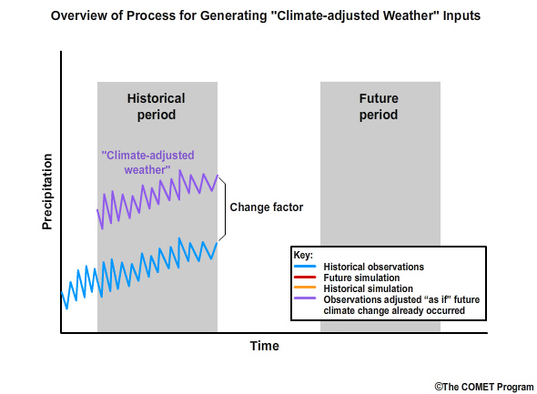
In this approach we will start with the observed past weather conditions and alter those “as if” the future climate changes had taken place already.
“As if” approach:
Estimate details of future conditions
Alter observed past weather as if climate change had already occurred
Important assumption: Historical observations are representative of future variability and sequences
The outcome is to develop climate-adjusted weather inputs that contain the detail depicted in the historical observations, but merged with the identified model-based trends of a given climate change scenario.
“Climate-adjusted weather” inputs:
Contain observation-based details
Merged with model-based climate change trends
Climate-adjusted Weather, Sequencing, and Climate Projections
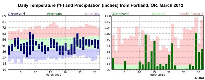
Two important terms that we will be using are: climate-adjusted weather and sequencing. Climate-adjusted weather is the term used to define detailed inputs in the future that have the specificity of weather inputs and the trends of climate change. Inputs may look like the observed daily temperature and precipitation seen in these graphs from Portland, Oregon in March 2012. In other words, the climate-adjusted weather inputs representing conditions in 2055, for example, include daily maximum and minimum temperatures, along with a daily precipitation total. These inputs have the detail of weather forecasts, but they should not be considered forecasts decades in the future. Instead, they are the result of altering past observations with future climate trends, as if those trends had already occurred.
Sequencing describes the order of events. For example, do wet and dry days alternate somewhat evenly or are there long stretches of dry days interspersed with stretches of consecutive wet days.
Climate-adjusted weather: Detailed inputs for future time period
Detail of observations
Trend of climate change
Use the “as if” approach: Alter past observations with future trends
Sequencing: The order of climate-adjusted weather events
Why Not Use Data Right from the Climate Projections?
The climate change projections that we already identified are capable of providing information that would allow us to get temperature and precipitation data at our required monthly and daily time steps in a future period. And, we have already determined that those projections will best represent our climate change scenarios. So, why don’t we just use those for daily and monthly time steps?
AR4 climate models do actually simulate weather in order to more accurately capture the complexities of the climate system. But these are not expected to be reliable for short time steps. We use the information from AR4 projections for examining the statistical representation of weather conditions. Those are used to establish the general trends and spread in the future. Furthermore, the climate projection data are not expected to simulate the correct sequencing of events.
What Do We Mean by Sequencing?
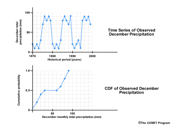
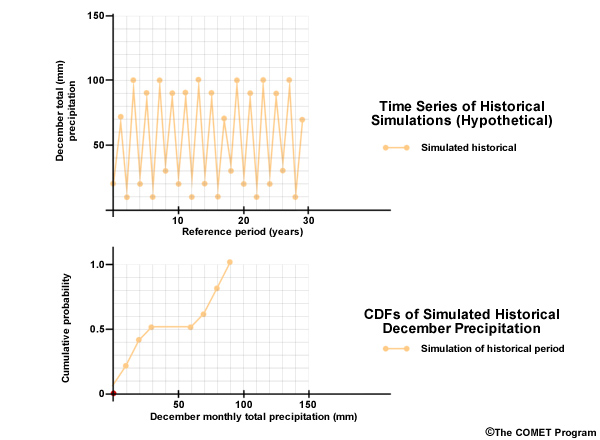
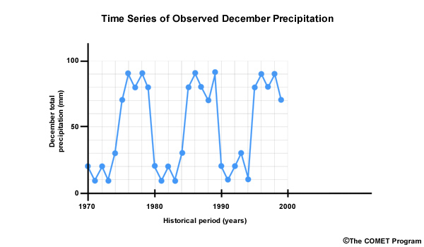
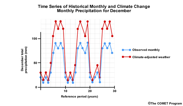
Let’s consider a hypothetical situation where over the course of 30 years, the observed December monthly precipitation was either greater than or equal to 70 mm or less than or equal to 30 mm. And let’s say the dry Decembers occurred in consecutive multi-year periods interspersed with equally long clusters of wet Decembers. This is shown by the blue line in the time series. This would result in an odd-shaped CDF that looks like this with rapid changes in cumulative probability at both the high and low end, but no changes for the middle values.
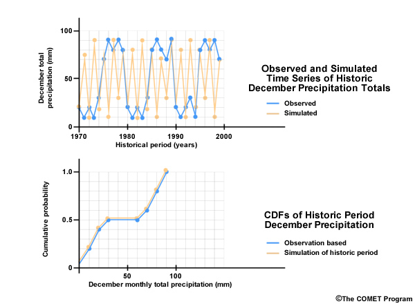
Now let’s look at simulated December monthly precipitation for this historical period—shown here in orange. Although it may not look like it, the distribution of monthly values during this 30 year period is the same for the simulation as it is for the observations. In the case of the simulation, the wet and dry Decembers alternate rather than cluster in multi-year wet and dry periods. The CDF for the simulation shows the same distribution as the observations and so it is shown here plotted on top of the observation-based CDF. In other words, the simulation from the climate projection matched the observations.
But, as you can see, the time series plots indicate that the simulation is not the same as the observations, because there is a very different sequence of wet and dry Decembers. It is this pattern of occurrence in the historical observed sequence that we want to preserve in our future simulation.
Develop Monthly Climate Weather: Hypothetical Case
Now we will walk through a method for generating climate-adjusted weather inputs on monthly time steps. We will continue with the hypothetical example that we just started. For simplicity, we will look at only December monthly precipitation, and one climate change scenario.
As introduced earlier, our approach involves taking the details reflected in historical observations, and adjusting those as if the climate change trends projected for the future had already occurred.
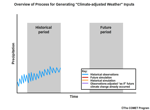
Step 1: Our first step is to generate the historical time series of observed monthly precipitation. This is represented by the blue line in the graph of monthly precipitation.
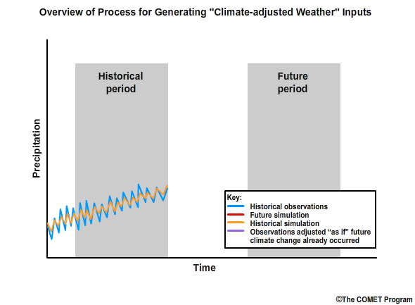
Step 2: Then we will simulate, using our identified climate projection, the monthly precipitation for the historical period. This is the orange line in the time series.
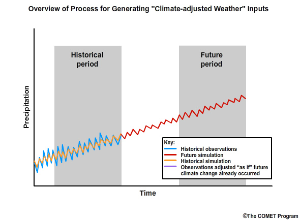
Step 3: Next we simulate the future values of monthly precipitation, again using our previously identified climate model projection. This is shown by the red line in the time series of monthly precipitation.
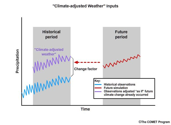
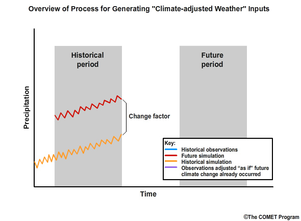
Step 4: We then quantify the difference in the means between the historical simulation and the future simulation. This quantification is the “change factor” which will be multiplicative for precipitation and incremental for temperature. The change factor represents how the historical simulation would need to be adjusted to match the future simulation.
Step 5: Finally we apply the change factor to the observation-based data of the historical period to get the monthly climate-adjusted weather as if climate change had already occurred in the observations.
Change Factor: how we convert observed conditions to conditions that are reasonable to expect in a future climate
In this methodology, step 4 involves the computation of a change factor. This is simply how we convert the observed conditions to conditions that are reasonable to expect under projected future climate conditions. Using this method, the relative range of values and the sequencing depicted in the observations are both preserved in the future.
The Change Factor
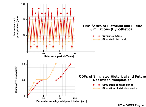
To get a better feel for what the change factor is representing, let’s look at a time series plot that combines two 30-year time periods, one historical and one future. We will start with the historical simulation, in orange, shown in both time series and CDF forms.
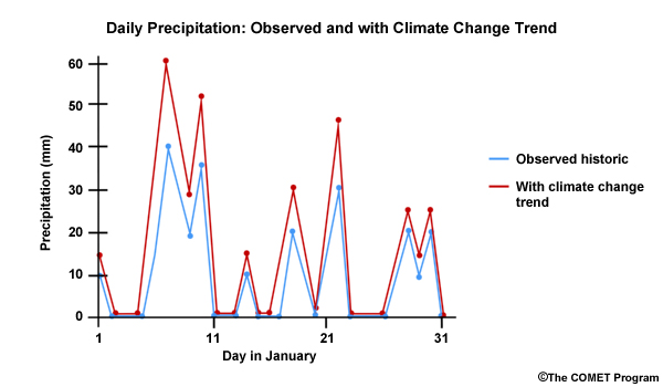
Now let’s consider a climate projection, in red, where simulated Decembers in the future are 50% wetter. We see this as an upward shift in the time series plots and the CDF is shifted right, more notably for the higher values. The change factor is the quantification of this shift. In this case it is an increase of 50% or a change factor of 1.50. In other words, the simulated historical period mean value would need to be multiplied by 1.50 to match the simulated future mean.
Now we can bring back the observation-based December data and multiply each month by the change factor of 1.50 to get a new time series where the values represent December monthly values as if climate change has already occurred.
This time series of potential future climate-adjusted weather embodies the climate change trend while reflecting the historical period sequencing.
Monthly Sequencing
When climate-adjusted weather is shown for all months (each with a specific change factor) we can get monthly sequencing. Change factors are computed for each calendar month separately. So, for example, each December in a 30-year period will receive the same change factor for a given scenario.
Consider this two-year slice of a future period climate-adjusted weather time series of monthly precipitation for the hotter and wetter scenario. Each January received the same January-specific change factor.
We can then add the Februarys, with a February-specific change factor for the same hotter/wetter scenario.
…then the Marches, with the March-specific change factor, and so on.
In the end we will have a monthly time series for this specific climate change scenario.
Develop Monthly Climate Weather: Real Data
Change factor: based on difference in 30-year monthly means between
Historical period, 1970-1999
Future period, 2030-2059
Using real data, we will now demonstrate this methodology for the area that we looked at earlier in the U.S. state of California. We will use the simulated mean monthly precipitation for a 30-year historical base period, 1970–1999, and a 30-year future period, 2030–2059. The change factor is based on the difference between the 30-year monthly means of the historical period and the future period. Remember that these data have already been bias corrected based on annual mean data, so the historical period simulations should be close to the observations.
December Precipitation
Climate Change Scenario |
Delta method |
Ensemble-informed Delta |
|---|---|---|
(single projection) |
(multiple projections) |
|
Hotter/Wetter |
1 monthly mean |
1 monthly mean |
Hotter/Drier |
1 monthly mean |
1 monthly mean |
Warmer/Drier |
1 monthly mean |
1 monthly mean |
Warmer/Wetter |
1 monthly mean |
1 monthly mean |
Central Tendency |
1 monthly mean |
1 monthly mean |
Again, as with the hypothetical example that we just did, we will use total monthly precipitation for December only. However, this time we will look at one mean precipitation value for each of the 5 climate change scenarios. In addition, we will look at two methodologies, Delta and Ensemble-informed Delta, for generating climate-adjusted weather inputs for each of those scenarios. Delta uses a single projection to determine the mean monthly value for each climate change scenario. Ensemble-informed Delta uses multiple projections, in our case 10, for each climate change scenario.
December Monthly Precipitation
Climate Change Scenario |
Delta method |
Ensemble-informed Delta |
|---|---|---|
Hotter/Wetter |
1 |
1 |
Hotter/Drier |
1 |
1 |
Warmer/Drier |
1 |
1 |
Warmer/Wetter |
1 |
1 |
Central Tendency |
1 |
1 |
Total |
5 |
5 |
10 sets of climate weather inputs for December precipitation (5 climate change scenarios x 2 methods)
Repeated for the other 11 months
Repeated for mean monthly temperature
So we will produce 10 sets of climate weather inputs for December precipitation, one set for each climate change scenario and each method. Remember that this will need to be done for the other 11 months as well as for the temperature variable.
We will compare the simulated historical period values with the simulated future period values to generate a period change factor. We will then apply that change factor to the observation-based time series to produce a time series that can represent conditions with future climate trends.
Capturing Observed Variability
Here is a time series plot of observed monthly precipitation totals from 1950–1999. All months are shown in blue, and the black circles represent each December of the 50 years. In a climate change scenario we want to preserve variability in the range between wet and dry, and in the sequencing, such as these series of months that are relatively dry.
Let’s make sure we understand the change factor process. The Decembers shown by the black circles will all have one common change factor applied. And that factor is based on the change from the simulated historical to the simulated future December means. When the twelve unique, month-specific change factors are applied to the whole time series, then we will have a time series that approximates what we expect for future monthly precipitation.
Here we add the same information for the month of December in the form of a CDF. So this observation-based CDF represents the distribution of 50 Decembers in the 1950–1999 historical period. Note that the high values in the 30-inch range that we saw in the time series plot are shown here in the upper end on the right side of the distribution.
Simulating the Historical Period
Here we see the simulation-based CDFs of the 1970–1999 historical period for each of the five climate change scenarios overlaid on the observation-based CDF for both the Delta and Ensemble-informed Delta approaches.
The CDFs of the 5 scenarios are represented by:
Red, for hotter/drier,
Green, for hotter/wetter,
Yellow, for warmer/drier,
Blue, for warmer/wetter, and
Gray, for the central tendency scenario
Looking first at the top graph showing the single-projection Delta approach, you may have noticed that the observations cover 50 years, 1950–1999, but the historical simulations cover 30 years, 1970–1999. Therefore, each color plot represents 30 simulated Decembers that are linearly interpolated to 50 plotting positions so that they plot along the observation-based CDF. The bottom graph shows the Ensemble-informed Delta approach. There are 300 data points for each climate change scenario. Each scenario is informed by ten ensemble members and each ensemble member has 30 data points, or 10 times 30 which equals 300 points. The 300 points for each simulation are interpolated to lie along the observation-based CDF.
It is difficult to differentiate the different scenarios because they are similar to each other and to the historical distribution. This is expected since this is a simulation of the historical period using the bias-corrected data. There are some differences, especially at the high end of the precipitation range. The differences arise from the fact that the bias correction was done at the coarser 2° grid resolution and the simulations are at the finer 1/8° grid resolution. The downscaling reintroduces some bias.
Simulating the Future
We see more differences between the five climate change scenarios when we examine these CDFs of future simulations of December precipitation totals. Once again, the black circles represent the observation-based CDF of December precipitation.
Note that the hotter/drier climate change scenario for the Delta method shows a wetter December than historical observations. This apparent contradiction showing wetter mean December precipitation in the 2030–2059 period is because the climate change scenarios were defined based on annual values. The mean annual precipitation trends may differ from individual monthly trends within the year.
Note that we see a greater departure from the observed values in the Delta method results.
Before we get to the change factors, let’s remind ourselves of the magnitude of annual changes in our selected climate projections.
In the Delta method we use simulations of historical and future conditions from the five projection runs, shown here, that were identified for our five climate change scenarios. So, for example, projection run number 35 represents the hotter and wetter scenario, with the future 30-year period showing annual values averaging 2.4°C (4.3°F) warmer and 15% wetter. Projection number 35 will be used to compute the change in mean December value for the scenario that describes a hotter and wetter future.
Likewise, these were the five ensembles of 10 projections for the five climate change scenarios that we will use in the Ensemble-informed Delta method.
Keeping with our hotter and wetter scenario as an example, the 10 members of the ensemble indicate a future 30-year period that ranges from around 1.9°C to >2.6°C warmer and from a few percent to around 22% wetter.
Remember that these are all annual changes. Any specific month within the year may show values that differ.
Obtaining Specific Monthly Change Factors
Change factor
Does not use observations
Based on differences between simulated historical and future values
Now lets take a closer look at how the change factor is derived. The change factor will not consider the observations. It will be based on the differences between the historical period simulations and the future period simulations.
If we compare the historical and the future simulations, we can visualize what goes into the change factor. Here we focus on climate change scenarios using the Delta method. The change factor is the quantification of the mean differences between these historical and future periods.
Let’s focus on just one scenario, hotter and wetter, represented by the green traces, shown here for the future and historical simulations.
Next we overlay the 30-year mean for the historical simulation in blue, and for the future in red. We will quantify the difference between historical and the future precipitation as the ratio of the future mean to the historical mean. That will lead to our change factor.
We will do the same thing using the Ensemble-informed Delta for December precipitation. The spread between scenarios in the high end of the CDFs is generally smaller than what we saw in the Delta method.
Again we will take just the green lines, the hotter/wetter scenario, representing the historical and the future period simulations. Here is the change in the mean December precipitation, from historical, blue, to future, red, when using the Ensemble-informed Delta method.
There is a greater difference in the means associated with the Delta method, and thus a greater change factor. In fact, the change factor with the Delta method is 1.50, meaning that future Decembers are projected to be 50% wetter. With the Ensemble-informed Delta, future Decembers are expected to be 10% wetter, and the change factor as computed in this case is 1.10.
In the Delta and Ensemble-informed Delta methods there is one change factor which is applied across all probabilities. There are other methods that use probability-specific change factors. For example, U.S. Bureau of Reclamation reports describe methods called hybrid Delta and Ensemble-informed hybrid Delta. In our example, we will focus just on the Delta and Ensemble-informed Delta methods and so we will be working with only one change factor per scenario across all probabilities.
Here we are looking at a depiction of the change factors for each scenario for the month of December. The hotter/wetter scenario that we were just looking at is the green line at a change factor of 1.50. It is merged with the warmer/wetter scenario, blue line, which also has a change factor of 1.50. Because there is one constant change factor for each scenario across the entire distribution, we have a flat line plot for each change factor.
The change factors are 1.00 for the central change scenario shown in gray, and 0.75 for the warmer and drier scenario shown in gold. Note that the hotter and drier scenario has a monthly precipitation change factor of 1.20, meaning that future Decembers are expected to be 20% wetter. In this case the monthly trend differs from the annual trend.
Here we see that the Delta and Ensemble-informed Delta methods produce different results when exploring how December precipitation is projected to change in the future.
You can see that the Ensemble-informed Delta method has a more narrow range of change factors. They vary from 0.81 for the warmer and drier scenario to 1.10 for the hotter/wetter scenario, and 1.23 for the warmer/wetter scenario.
Obtaining Specific Month Climate-Adjusted Precipitation
Next we will use the change factors we just derived to compute the specific monthly values for detailed climate-adjusted weather. We will start with the observed historical precipitation, in this case the monthly Decembers shown by the circles. We will then multiply those values by a change factor, and get the December precipitation with the historical sequencing but as if the future trend had already occurred.
The December 1951 precipitation is 20 inches. The Delta method, for the hotter/wetter scenario would make the corresponding future December 30 inches. Likewise the Ensemble-informed Delta for the warmer/drier scenario would result in the corresponding climate change December precipitation of 16.2 inches.
December Climate-adjusted Weather, All Scenarios
Once we apply change factors associated with all five scenarios and both methods, we can construct a CDF for the future December precipitation values. The CDFs show the same distribution of relative values seen in the observation-based CDF, but shifted, based on its specific tendency within the given climate change scenario. This is expected because in the “as if” approach, the “future” values are just the observations with change factors applied. For the Delta method, the two wetter scenarios, shown with blue and green, are plotted on top of each other. They suggest a wetter future than the historical climatology. The hotter drier scenario also suggests a wetter future, at least for the month of December, while the warmer and drier scenario shows a drier future, and the central tendency suggests the same magnitude distribution as the historical observations.
Ensemble-informed Delta:
Each change factor is an average of change factors from 10 projections
Mutes large variations often seen when using change factors based on single projections
As pointed out earlier, in the Ensemble-informed Delta method, our scenario-specific change factors are the average of the change factors from all ten projections in the ensemble. This often produces smaller magnitude changes and variations than those using the Delta method. We can see this in the more narrow concentration of CDF plots. Theoretically, with Ensemble-informed Delta we have muted the large variations associated with single projections, and thus the results allow us to focus more on the general trend, which is sometimes called the climate change signal.
Change Factors: All Months
Change factors will be computed separately for each month and each climate change scenario. Here we see the month-specific change factors for our example case, presented as percent change.
The first set of five month-specific change factors corresponds to each of the five climate change scenarios using the Delta method. For example, the hotter/wetter scenario, green line, for December shows a 50% increase in future December precipitation. But it also shows drier months from April to October. Since this location, on the U.S. West Coast, gets most of its precipitation in the winter months, the annual trend is for wetter due to the November-March contributions.
Note that the hotter, drier scenario, red, shows a wetter trend for August and December, even though it is a drier scenario overall.
The second set of five month-specific change factors corresponds to each of the five climate change scenarios using the Ensemble-informed Delta method. But since there are ten projections in each scenario ensemble, the percent change is the average of the 10 period change values in the ensemble.
We can see that when we use Ensemble-informed Delta there is less month-to-month variation in the change factors. This may be desirable for emphasizing the climate change signal rather than noise. There are exceptions, however. We can see that the warmer/wetter scenario in February has greater changes when using Ensemble-informed Delta.
Overall, we can see that the green and blue lines, representing the wetter scenarios, generally show positive changes in the wetter winter months. The golds and reds, representing the drier climate scenarios, are mainly negative. There is month-to-month variation, and it’s more obvious when using the single-projection Delta method.
Using Temperature instead of Precipitation
The example that we have been using was for the climate-adjusted weather input of monthly precipitation for each climate change scenario and each of the two methods. Developing climate-adjusted weather inputs of mean monthly temperature is done the same way, with one difference. The change factor will be an incremental factor rather than a multiplicative factor.
Temperature change factor = future simulation mean – historical simulation mean
Climate-adjusted temperature inputs = temperature observations + temperature change factor
It is derived by subtracting the historical simulation mean from the future simulation mean. Then the climate-adjusted temperature inputs would be: the temperature observations, plus the change factor (which could be negative if there is a cooler climate change scenario).
Develop Daily Climate Weather Inputs
Climate impacts models often require data on daily time steps. Those daily data can include, but are not limited to:
Total daily precipitation
Temperature: daily maximum and minimum
These are required to produce estimates of evapotranspiration, infiltration, snowmelt, runoff, and other hydrologic variables.
Daily climate-adjusted weather:
Reflect realistic range of values and sequence of events
Based on observations with projected future trends
As with the monthly climate-adjusted weather inputs, we want the daily input to reflect realistic values in terms of both the range and the sequence. And, as with the monthly climate weather input, daily climate-adjusted weather values will be based on historical observations and projected trends in future climate.
Let’s consider the daily observed weather in the month of January during year 1 of the 50-year historical base period. If the historical period is 1950–1999, then year 1 is 1950. Here is an example time series of daily observed precipitation in January. For the future period, let’s consider the “hotter and wetter” climate change scenario. And for that scenario the precipitation change factor for January is 1.5. The precipitation change factor is applied equally to each day of the month. The result is a daily precipitation time series with the trend for a hotter/wetter climate change scenario, and the sequencing seen in the daily historical record.
The temperature change factor is an incremental factor, for example, +2°. It is applied equally to both daily maximum and minimum temperatures.
Exercise: Adjusted daily conditions
In this exercise we will practice deriving daily climate-adjusted weather values.
Summary and Next Steps
In STEP 4 we illustrate a process where we generate climate-adjusted weather inputs from simulated monthly climate change projections and historical observations. These climate-adjusted weather inputs are used to model the impacts of climate change on water resources, including the impact on surface hydrology and crop irrigation requirements.
Here are a few important assumptions of the methodology demonstrated, regardless of which method, Delta or Ensemble-informed Delta, is used.
The change factor adjustments are done for bias-corrected and downscaled data.
The “as if” approach:
Computes a climate change factor based on mean simulated changes from the historical period to the future period; then,
Uses that climate change factor to adjust historical observations as if climate change had already occurred, and results in,
Climate-adjusted weather inputs that reflect climate change trends and contain the variations and sequencing of past observations.
The precipitation adjustment is performed with a multiplicative factor.
The temperature adjustment is done with an incremental factor.
Change factors are month-specific, and apply equally to each month for all years in the historical period.
Monthly data may be disaggregated into daily time steps. The month-specific change factors will apply equally to daily observations for each day in the month.
Realistic variations and sequencing of conditions on a background of climate change
ESM data:
Little confidence in variations and sequencing
Good confidence in trends of means
Climate-adjusted weather:
Variability and sequencing tied to historical observations
Trends in means driven by ESM projections
These data are intended for planning purposes. The methods shown here are designed to give realistic variations and sequences of conditions for monthly and daily time steps on the background of climate change.
There is a certain comfort using historical observations as a guide. That’s because there is little confidence regarding variability and sequencing produced by ESMs, but there is greater confidence in the trends of the means. So the expected variability in climate-adjusted weather is tied to historical observations while the trend in the means is driven by the model projections.
Delta and Ensemble-informed Delta
Limited ability to represent changes in variability and sequencing
Only adjusts for intensity, not for duration and frequency
Keep in mind, if variability and sequencing do change with a changing climate, these methods are limited in their ability to represent those changes. Precipitation, for example, can be described by the attributes of intensity, duration, and frequency. With the Delta and Ensemble-informed Delta methods, we are only adjusting for intensity. The duration and frequency remain defined by the precipitation characteristics in the historical observations.
More persistent dry or wet periods as a result of climate change would not be well represented with these methods. In other words, the climate may change in unexpected ways that would not be captured simply by using the Delta or Ensemble-informed Delta method.
References
SYMAP method (associated with BCSD spatial downscaling): Shepard, D.S. (1984) Computer mapping: The SYMAP interpolation algorithm, in Spatial Statistics and Models, edited by G.L. Gaile and C.J. Willmott, pp. 133 145, D. Reidel, Norwell, Mass.).`
Wood, A.W., E.P. Maurer, A. Kumar, and D.P. Lettenmaier (2002) Long-range experimental hydrologic forecasting for the eastern United States. J. Geophysical Research-Atmospheres 107(D20), 4429. http://www.agu.org/pubs/crossref/2002/2001JD000659.shtml`
