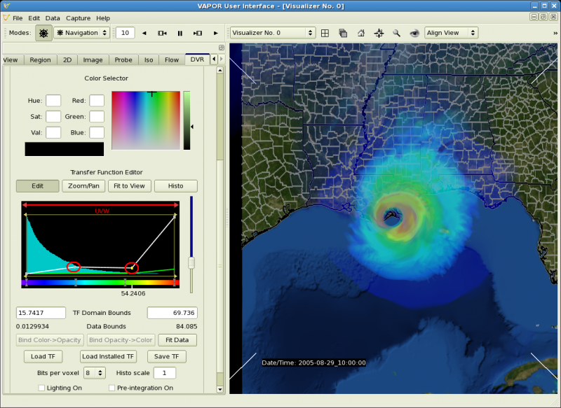
A "transfer function" is a mapping from data to color and opacity. The transfer function editor is used to control the color and opacity in the volume rendering of your data. Generally the opacity is used to identify the values of the variable that most interesting; other values can be made transparent. Color is used to highlight particular values, e.g. to distinguish them from other values.
We continue to work with time step 10, around the time of landfall.
With hurricane Katrina we are interested in the largest values of the wind speed, particularly as the hurricane strikes land. In the following we shall edit the UVW transfer function to be more opaque where the wind is strongest. The wind will be colored red at the highest values, violet at the lowest values.
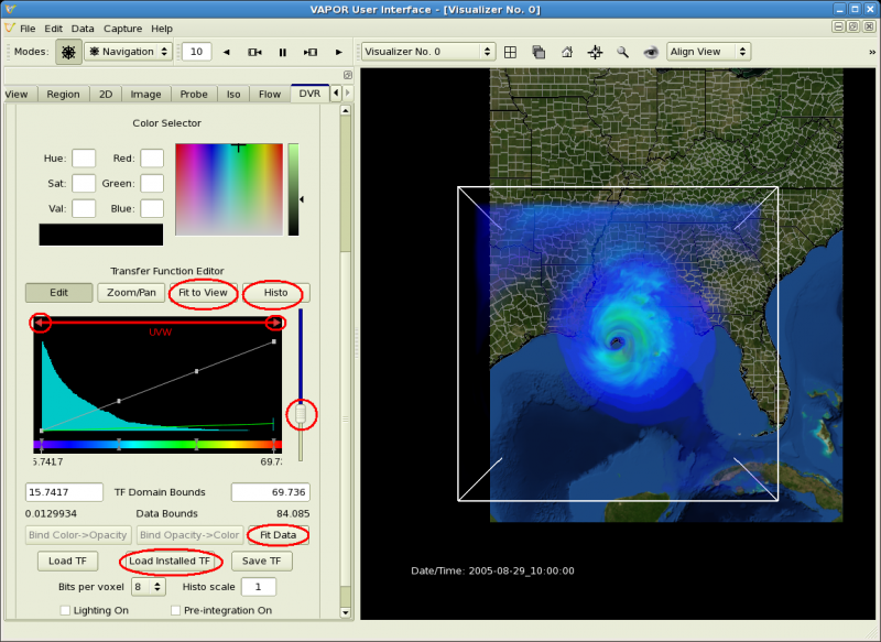
Consider the following image of the transfer function editor, in which several key features have been identified.

The vapor transfer function editor provides control over color and opacity. There is an editor window where you can manipulate color and opacity with the mouse. The upper part of the editor window has a black background, in which is displayed a histogram and an opacity graph. At the bottom of the editor window is a rainbow-colored color bar.
The editor window displays the color and opacity associated with values of the variable in between the values specified as "TF Domain Bounds". The histogram shows the frequency of data values in the interval specified by the TF Domain bounds. You can control the data interval position by dragging the domain bar or its end-arrows at the top of the editor window.
The color is determined by the colors at a number of control points on the color bar. The color between two control points is interpolated in HSV space. The opacity is determined by the opacity graph. The opacity, which takes values between 0 and 1, is linearly interpolated between its values at opacity control points. The opacity slider applies a scale factor to the opacity values.
Several of the buttons we are using are circled in the above figure:
There are several ways of modifying the transfer function. The color or opacity values at an existing control point can be changed by selecting the point and clicking with the right mouse button. Right-click on a desired location to create a new control point. Existing control points can be moved by selecting and dragging them with the left mouse button.
We shall use the above features to enable us to see where the wind is strongest.
Click on the "Load installed TF" button and select "reversed.vtf". This transfer function reverses the color map so that large values are yellow to red, small values are blue to violet.
Click the "Fit Data" button, and then click "Fit to View" and "Histo". Now we are set up to edit the transfer function values at the current time step (10).
Because we are only interested in the larger wind values, grab the left end of the domain bar and slide about 1/6 of the way to the right across the window, setting the left TF domain bound to a value of about 15. Likewise, move the right end of the domain bar to the left, setting the right TF domain bound to about 70. Alternatively, you can just type in the values of 15 and 70 for the left and right TF domain bounds.
To better expose the internal structure of the hurricane, slide the opacity slider down to about 1/3 of the window height (resulting in an opacity scale factor of about 0.13). Click "Fit to View" and "Histo" to examine the values of wind speed in the mapping interval.
The visualizer window should now display the hurricane as follows, showing the eye from above as it lands in New Orleans. Note the transfer function and how it identifies the area where the wind is strong.
We can tweak the transfer function to show more clearly the region where the wind is strongest. Note the four control points that define the opacity graph in the transfer function window. We can move them down to make the lower values of UVW more transparent. Grab each of the two middle control points and pull them downward, as in the image below (look at the two circled control points). Now you can see that the strongest wind is colored red and appears in the eyewall of the hurricane: