Looking at the simulation#
Here we will plot a few diagnostics to see what happens to the ice sheet during the simulation. We will focus on comparing the last time slice to the first time slice.
First, and for convenience, we will rename the first output file corresponding to year 2015.
Find your history output on derecho (descibed above as well):
cd /glade/derecho/scratch/$USER/archive/T_GrIS_SSP585_2015_2100/glc/hist
ls
Rename the initial_hist file to the start date and time:
mv T_GrIS_SSP585_2015_2100.cism.gris.initial_hist.2015-01-01-00000.nc T_GrIS_SSP585_2015_2100.cism.gris.h.2015-01-01-00000.nc
Load a good kernal
We recommend you use a kernal in this notebook that contains the most recent version of the conda-npl library as possible. In 2026, that will be
NPL 2026a
Loading packages#
#import xarray as xr
import numpy as np
import matplotlib as mpl
import matplotlib.pyplot as plt
import matplotlib.colors as mplc
import matplotlib.cm as mcm
from netCDF4 import Dataset
import netCDF4

# to display figures in notebook after executing the code.
%matplotlib inline
Set your user name#
User = 'katec'
Set the 2 years you would like to compare#
year1 = '2016'
year2 = '2101'
Defining the path and filenames#
# Defining the path
path_to_file = '/glade/derecho/scratch/' + User + '/archive/T_GrIS_SSP585_2015_2100_261/glc/hist/'

# Defining the files to compare
file1 = path_to_file + 'T_GrIS_SSP585_2015_2100_261.cism.gris.h.' + year1 + '-01-01-00000.nc'
file2 = path_to_file + 'T_GrIS_SSP585_2015_2100_261.cism.gris.h.' + year2 + '-01-01-00000.nc'

# Loading the data
ncfile = Dataset(file1,'r')
thk1 = np.squeeze(ncfile.variables["thk"][0,:,:])        # ice thickness
artm1 = np.squeeze(ncfile.variables["artm"][0,:,:])      # air temperature
smb1 = np.squeeze(ncfile.variables["smb"][0,:,:])/1000.  # surface mass balance, switching the units from mm/yr w.e. to m/yr w.e
ncfile.close()

ncfile = Dataset(file2,'r')
thk2 = np.squeeze(ncfile.variables["thk"][0,:,:])
artm2 = np.squeeze(ncfile.variables["artm"][0,:,:])
smb2 = np.squeeze(ncfile.variables["smb"][0,:,:])/1000.    # switching the units from mm/yr w.e. to m/yr w.e
ncfile.close()

# Computing the differences in the different variables
diff_thk  = thk2 - thk1    # thickness difference
diff_artm = artm2 - artm1  # air temperature difference
diff_smb  = smb2 - smb1    # SMB difference
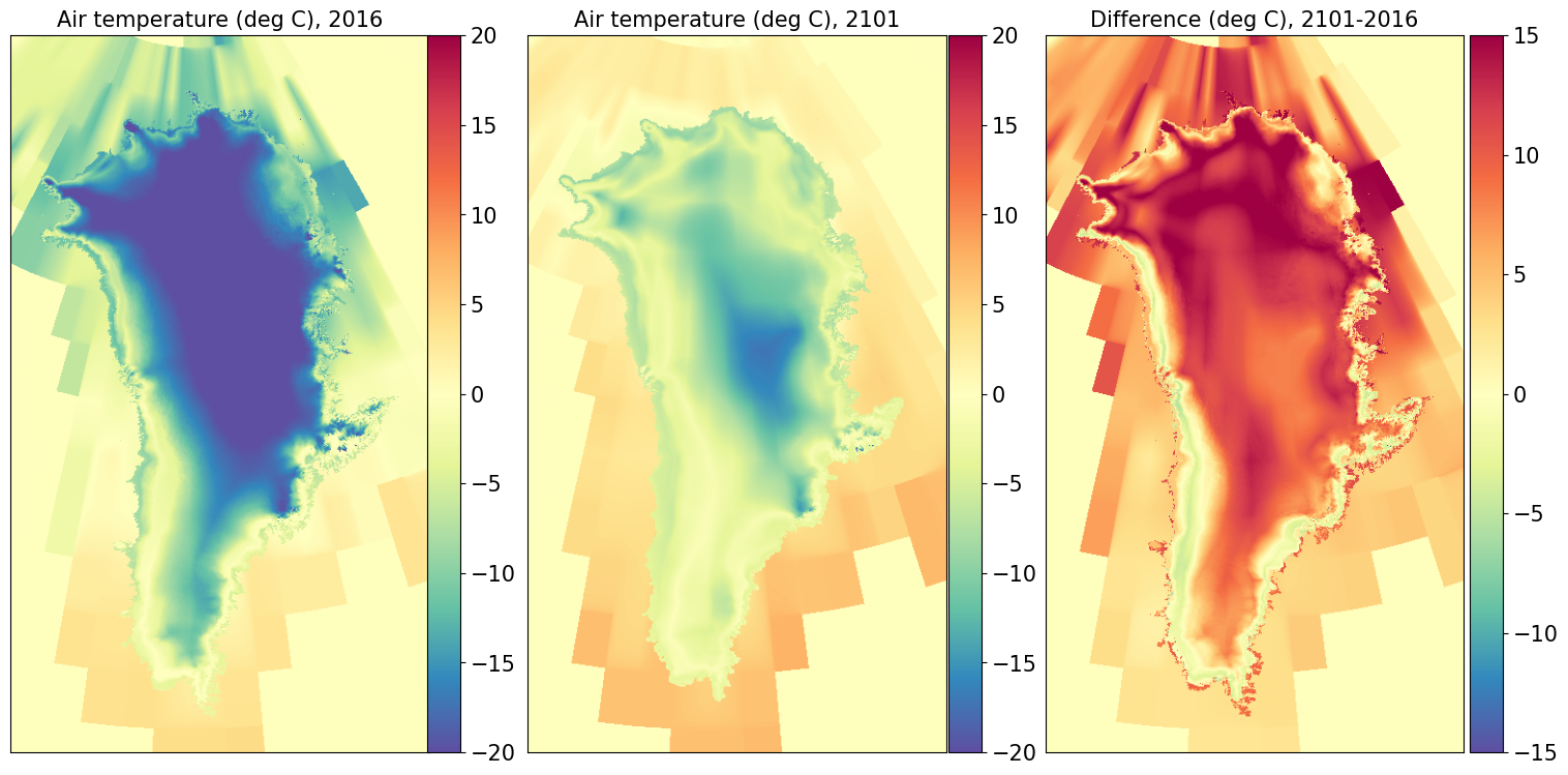
Looking at 2D plots#
Note: In these plots, you can adjust the range of the colorbars by adjusting the “vmin” and “vmax” values of each subplot.
Air temperature#
labelsize=15
my_cmap = mpl.colormaps['Spectral_r']
fig, ax = plt.subplots(1, 3, sharey=True, figsize=[21, 9])


# Plotting air temperature for year1

vmin = -20
vmax = 20
last_panel0 = ax[0].imshow(artm1, vmin=vmin, vmax=vmax,
                       cmap=my_cmap)
title0 = 'Air temperature (deg C), ' + year1
ax[0].set_title(title0, fontsize=labelsize)
fig.subplots_adjust(right=0.8)
pos = ax[0].get_position()
cax = fig.add_axes([0.32, pos.y0, 0.015, pos.y1 - pos.y0])
cbar = fig.colorbar(last_panel0,cax=cax)
cbar.ax.tick_params(labelsize=labelsize)
cbar.ax.get_yaxis().labelpad = 15


# Plotting air temperature for year2

last_panel1 = ax[1].imshow(artm2, vmin=vmin, vmax=vmax,
                       cmap=my_cmap)
title1 = 'Air temperature (deg C), ' + year2
ax[1].set_title(title1, fontsize=labelsize)
pos = ax[1].get_position()
cax = fig.add_axes([0.56, pos.y0, 0.015, pos.y1 - pos.y0])
cbar = fig.colorbar(last_panel1,cax=cax)
cbar.ax.tick_params(labelsize=labelsize)
cbar.ax.get_yaxis().labelpad = 15


# Plotting the difference in air temperature

vmin = -15
vmax = 15
last_panel2 = ax[2].imshow(diff_artm, vmin=vmin, vmax=vmax,
                       cmap=my_cmap)
title2 = 'Difference (deg C), ' + year2 + '-' + year1
ax[2].set_title(title2, fontsize=labelsize)
pos = ax[2].get_position()
cax = fig.add_axes([0.8, pos.y0, 0.015, pos.y1 - pos.y0])
cbar = fig.colorbar(last_panel2,cax=cax)
cbar.ax.tick_params(labelsize=labelsize)
for i in range(len(ax)):
    ax[i].invert_yaxis()
    ax[i].set_xlabel('')
    ax[i].set_ylabel('')
    ax[i].set_xticklabels('')
    ax[i].set_yticklabels('')
    ax[i].set_xticks([])
    ax[i].set_yticks([])
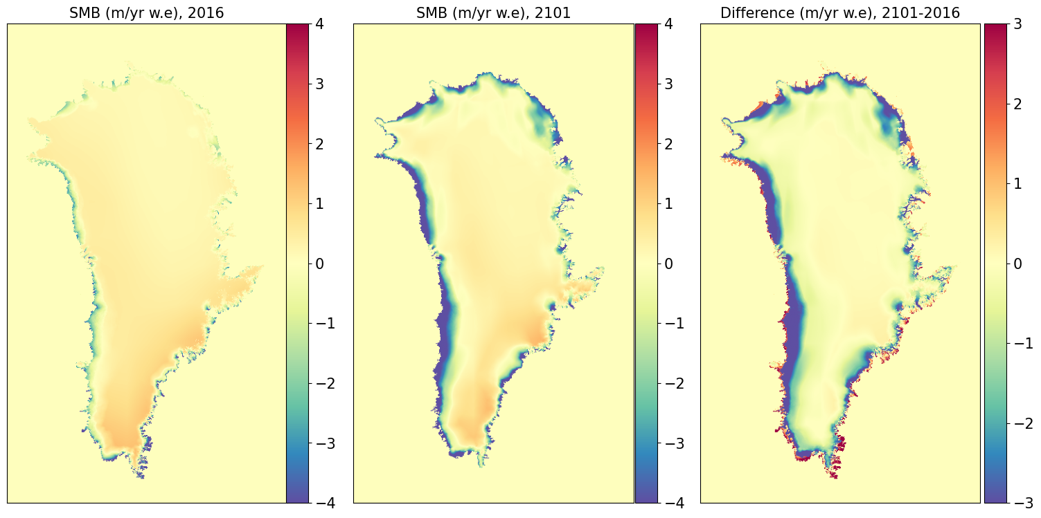
Surface mass balance#
labelsize=15
y_cmap = mpl.colormaps['Spectral_r']
fig, ax = plt.subplots(1, 3, sharey=True, figsize=[21, 9])


# Plotting SMB for year1

vmin = -4
vmax = 4
last_panel0 = ax[0].imshow(smb1, vmin=vmin, vmax=vmax,
                       cmap=my_cmap)
title0 = 'SMB (m/yr w.e), ' + year1
ax[0].set_title(title0, fontsize=labelsize)
fig.subplots_adjust(right=0.8)
pos = ax[0].get_position()
cax = fig.add_axes([0.32, pos.y0, 0.015, pos.y1 - pos.y0])
cbar = fig.colorbar(last_panel0,cax=cax)
cbar.ax.tick_params(labelsize=labelsize)
cbar.ax.get_yaxis().labelpad = 15


# Plotting SMB for year2

last_panel1 = ax[1].imshow(smb2, vmin=vmin, vmax=vmax,
                       cmap=my_cmap)
title1 = 'SMB (m/yr w.e), ' + year2
ax[1].set_title(title1, fontsize=labelsize)
pos = ax[1].get_position()
cax = fig.add_axes([0.56, pos.y0, 0.015, pos.y1 - pos.y0])
cbar = fig.colorbar(last_panel1,cax=cax)
cbar.ax.tick_params(labelsize=labelsize)
cbar.ax.get_yaxis().labelpad = 15


# Plotting the difference in SMB

vmin = -3
vmax = 3
last_panel2 = ax[2].imshow(diff_smb, vmin=vmin, vmax=vmax,
                       cmap=my_cmap)
title2 = 'Difference (m/yr w.e), ' + year2 + '-' + year1
ax[2].set_title(title2, fontsize=labelsize)
pos = ax[2].get_position()
cax = fig.add_axes([0.8, pos.y0, 0.015, pos.y1 - pos.y0])
cbar = fig.colorbar(last_panel2,cax=cax)
cbar.ax.tick_params(labelsize=labelsize)
for i in range(len(ax)):
    ax[i].invert_yaxis()
    ax[i].set_xlabel('')
    ax[i].set_ylabel('')
    ax[i].set_xticklabels('')
    ax[i].set_yticklabels('')
    ax[i].set_xticks([])
    ax[i].set_yticks([])
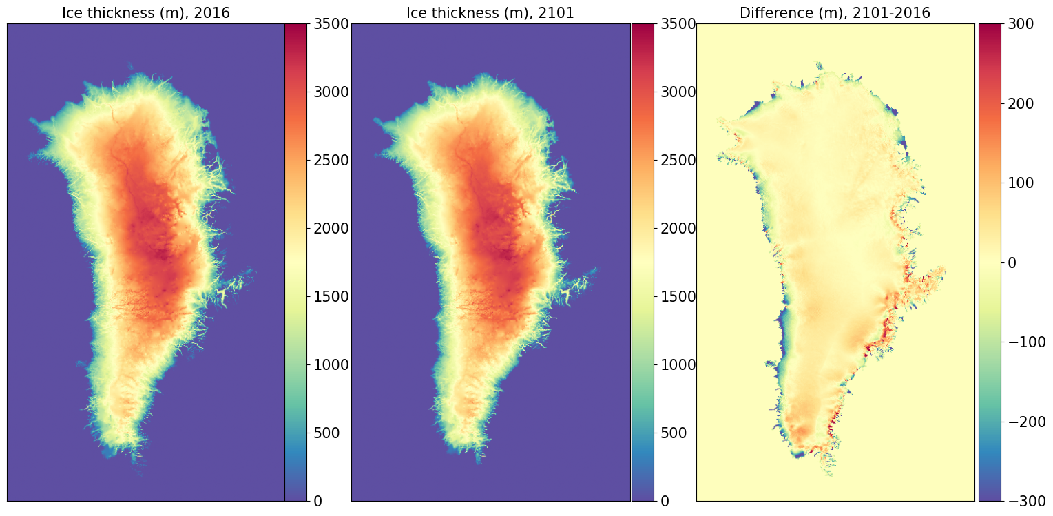
Ice Thickness#
labelsize=15
my_cmap = mpl.colormaps['Spectral_r']
fig, ax = plt.subplots(1, 3, sharey=True, figsize=[21, 9])


# Plotting thickness for year1

vmin = 0
vmax = 3500
last_panel0 = ax[0].imshow(thk1, vmin=vmin, vmax=vmax,
                       cmap=my_cmap)
title0 = 'Ice thickness (m), ' + year1
ax[0].set_title(title0, fontsize=labelsize)
fig.subplots_adjust(right=0.8)
pos = ax[0].get_position()
cax = fig.add_axes([0.32, pos.y0, 0.015, pos.y1 - pos.y0])
cbar = fig.colorbar(last_panel0,cax=cax)
cbar.ax.tick_params(labelsize=labelsize)
cbar.ax.get_yaxis().labelpad = 15


# Plotting thickness for year2

last_panel1 = ax[1].imshow(thk2, vmin=vmin, vmax=vmax,
                       cmap=my_cmap)
title1 = 'Ice thickness (m), ' + year2
ax[1].set_title(title1, fontsize=labelsize)
pos = ax[1].get_position()
cax = fig.add_axes([0.56, pos.y0, 0.015, pos.y1 - pos.y0])
cbar = fig.colorbar(last_panel1,cax=cax)
cbar.ax.tick_params(labelsize=labelsize)
cbar.ax.get_yaxis().labelpad = 15


# Plotting the difference in ice thickness

vmin = -300
vmax = 300
last_panel2 = ax[2].imshow(diff_thk, vmin=vmin, vmax=vmax,
                       cmap=my_cmap)
title2 = 'Difference (m), ' + year2 + '-' + year1
ax[2].set_title(title2, fontsize=labelsize)
pos = ax[2].get_position()
cax = fig.add_axes([0.8, pos.y0, 0.015, pos.y1 - pos.y0])
cbar = fig.colorbar(last_panel2,cax=cax)
cbar.ax.tick_params(labelsize=labelsize)
for i in range(len(ax)):
    ax[i].invert_yaxis()
    ax[i].set_xlabel('')
    ax[i].set_ylabel('')
    ax[i].set_xticklabels('')
    ax[i].set_yticklabels('')
    ax[i].set_xticks([])
    ax[i].set_yticks([])
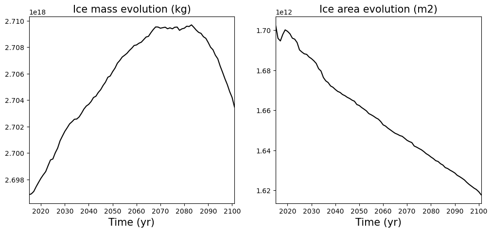
Looking at time series#
Each output history file contains a few scalars that give information about the state of the ice sheet. Here we are going to look at:
the grounded ice area
the ice mass
the ice mass above flotation
While we could create an array using python for each scalar by looping through every single file, it is convenient to extract them in their own file using nco. To do this we will use the command “ncrcat”
On derecho:
module load nco
For mass
ncrcat -v imass T_GrIS_SSP585_2015_2100.cism.gris.h.*.nc mass.nc
For grounded ice area
ncrcat -v iareag T_GrIS_SSP585_2015_2100.cism.gris.h.*.nc area_ground.nc
Now we can look at the time series evolution
# Loading the variables
file_mass = path_to_file + "mass.nc"
file_areag = path_to_file + "area_ground.nc"

ncfile = Dataset(file_mass,'r')
mass = ncfile.variables["imass"][:]
time_mass = ncfile.variables["time"][:]
ncfile.close()

ncfile = Dataset(file_areag,'r')
area = ncfile.variables["iareag"][:]
time_area = ncfile.variables["time"][:]
ncfile.close()
labelsize=15

timemin = 2015
timemax = 2101

color = 'black'
line = '-'

plt.figure(figsize=(12,5))

# Plotting the Ice mass evolution time series

plt.subplot(121)
plt.plot(time_mass, mass, line, ms=3, mfc=color, color=color)
plt.xlim([timemin, timemax])
plt.xlabel('Time (yr)', multialignment='center',fontsize=labelsize)
plt.title('Ice mass evolution (kg)',fontsize=labelsize)


# Plotting the Ice area evolution time series

plt.subplot(122)
plt.plot(time_area, area, line, ms=3, mfc=color, color=color)
plt.xlim([timemin, timemax])
plt.xlabel('Time (yr)', multialignment='center',fontsize=labelsize)
plt.title('Ice area evolution (m2)',fontsize=labelsize)
Text(0.5, 1.0, 'Ice area evolution (m2)')