Advanced Plotting#
BEFORE BEGINNING THIS EXERCISE - Check that your kernel (upper right corner, above) is NPL 2025b. This should be the default kernel, but if it is not, click on that button and select NPL 2025b.
This activity was developed primarily by Cecile Hannay and Jesse Nusbaumer.
Exercise 1: CAM-SE output analysis#
Examples of simple analysis and plotting that can be done with CAM-SE output on the native cubed-sphere grid.
NOTE: A newer, likely easier method for plotting unstructured grids like this can be found in the “uxarray” notebook under the diagnostics/additional folder.
from pathlib import Path
import xarray as xr
import numpy as np
import matplotlib.pyplot as plt
import cartopy.crs as ccrs
def make_map(data, lon, lat,):
    """This function plots data on a Mollweide projection map.

    The data is transformed to the projection using Cartopy's `transform_points` method.

    The plot is made by triangulation of the points, producing output very similar to `pcolormesh`,
    but with triangles instead of rectangles used to make the image.
    """
    dataproj = ccrs.PlateCarree() # assumes data is lat/lon
    plotproj = ccrs.Mollweide()   # output projection
    # set up figure / axes object, set to be global, add coastlines
    fig, ax = plt.subplots(figsize=(6,3), subplot_kw={'projection':plotproj})
    ax.set_global()
    ax.coastlines(linewidth=0.2)
    # this figures out the transformation between (lon,lat) and the specified projection
    tcoords = plotproj.transform_points(dataproj, lon.values, lat.values) # working with the projection
    xi=tcoords[:,0] != np.inf  # there can be bad points set to infinity, but we'll ignore them
    assert xi.shape[0] == tcoords.shape[0], f"Something wrong with shapes should be the same: {xi.shape = }, {tcoords.shape = }"
    tc=tcoords[xi,:]
    datai=data.values[xi]  # convert to numpy array, then subset
    # Use tripcolor --> triangluates the data to make the plot
    # rasterized=True reduces the file size (necessary for high-resolution for reasonable file size)
    # keep output as "img" to make specifying colorbar easy
    img = ax.tripcolor(tc[:,0],tc[:,1], datai, shading='gouraud', rasterized=True)
    cbar = fig.colorbar(img, ax=ax, shrink=0.4)
    return fig, ax
Input data#
In the following cell, specify the data source.
location_of_hfiles is a path object that points to the directory where data files should be.
search_pattern specifies what pattern to look for inside that directory.
SIMPLIFICATION If you want to just provide a path to a file, simply specify it by commenting (with #) the lines above “# WE need lat and lon”, and replace with:
fil = "/path/to/your/data/file.nc"
ds = xr.open_dataset(fil)
Parameters#
Specify the name of the variable to be analyzed with variable_name.
To change the units of the variable, specify scale_factor and provide the new units string as units. Otherwise, just set scale_factor and units:
scale_factor = 1
units = ds["variable_name"].attrs["units"]
location_of_hfiles = Path("/glade/campaign/cesm/tutorial/diagnostics_tutorial_archive/b1850.five_years/atm/hist/")
search_pattern = "b1850.five_years.cam.h1a.0005-12-08-00000.nc"

fils = sorted(location_of_hfiles.glob(search_pattern))
if len(fils) == 1:
    ds = xr.open_dataset(fils[0])
else:
    print(f"Just so you konw, there are {len(fils)} files about to be loaded.")
    ds = xr.open_mfdataset(fils)

# We need lat and lon:
lat = ds['lat']
lon = ds['lon']

# Choose what variables to plot,
# in this example we are going to combine the
# convective and stratiform precipitation into
# a single, total precipitation variable
convective_precip_name = "PRECC"
stratiform_precip_name = "PRECL"

# If needed, select scale factor and new units:
scale_factor = 86400. * 1000. # m/s -> mm/day
units = "mm/day"

cp_data = scale_factor * ds[convective_precip_name]
st_data = scale_factor * ds[stratiform_precip_name]
cp_data.attrs['units'] = units
st_data.attrs['units'] = units

# Sum the two precip variables to get total precip
data = cp_data + st_data
data
# temporal averaging
# simplest case, just average over time:
data_avg = data.mean(dim='time')
data_avg
#
# Global average
#
data_global_average = data_avg.weighted(ds['area']).mean()
print(f"The area-weighted average of the time-mean data is: {data_global_average.item()}")
#
# Regional average using a (logical) rectangle
#
west_lon = 110.0
east_lon = 200.0
south_lat = -30.0
north_lat = 30.0

# To reduce to the region, we need to know which indices of ncol dimension are inside the boundary

region_inds = np.argwhere(((lat > south_lat)&(lat < north_lat)&(lon>west_lon)&(lon<east_lon)).values)
print(f"The number of grid columns inside the specified region is {region_inds.shape[0]}")

# get the area associated with each selected column. Note the region_inds array needs to be flattened to use in isel.
region_area = ds['area'].isel(ncol=region_inds.flatten())
# get the data in the region:
region_data = data_avg.isel(ncol=region_inds.flatten())

data_region_average = region_data.weighted(region_area).mean()
print(f"The area-weighted average in thee region [{west_lon}E-{east_lon}E, {south_lat}-{north_lat}] is: {data_region_average.item()}")
# plot the map of the time average
# using the function defined above.
fig1, ax1 = make_map(data_avg, lon, lat,)
fig1.savefig(fname="advanced_plot_1.png")
Click here for the solution
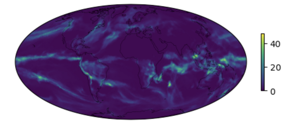
Figure: Plotting solution.